This topic deals with the display of Grasshopper shapes and data in the Rhinoceros viewports. This is a fairly complex topic as display properties may come from many places, and without an understanding of the hierarchies and interactions involved, bending the display to serve one's needs will be frustrating.
We shall begin with a discussion of Grasshopper's application-level display settings, then touch upon parameter-level overrides, and finally explore the effects of meta data on the display of individual shapes including how display rules can be leveraged to visualise meta data in the Rhinoceros viewports.
Display Settings
Any geometrical data in a Grasshopper document is automatically drawn in all Rhinoceros viewports. Although these shapes are visible, but cannot be selected or modified using Rhinoceros commands, nor will they be included when saving 3dm files. Application-level display settings control the visual properties of these phantom shapes, such as the symbol and size of points, the thickness and dash patterns of curves and edges, and of course the colours of selected and unselected shapes.
Note that in Grasshopper, unlike in Rhinoceros, individual shapes themselves cannot be selected and their selection state always derives from the selection state of whatever component or parameter contains those shapes. As such, the term "selected" has a somewhat different meaning in Grasshopper versus Rhinoceros.
By default, unselected shapes in Grasshopper 2 are grey, while selected ones are yellow. Points are drawn as crosses, curves are drawn as solid strokes, edges are drawn as slightly thinner solid strokes, and so on. However, all of these settings can be changed, and in fact Grasshopper ships with several predefined display styles, leveraging the flexibility of the display settings to various degrees. The current display settings can be seen and modified via the Display Settings… item in the Display top level menu.
As shown in Figure 1, the settings window is split into two halves and multiple rows, and contains a lot of very dense information. Therefore it does not use common interface elements such as buttons or checkboxes, and this will probably confuse the unwary first time user.
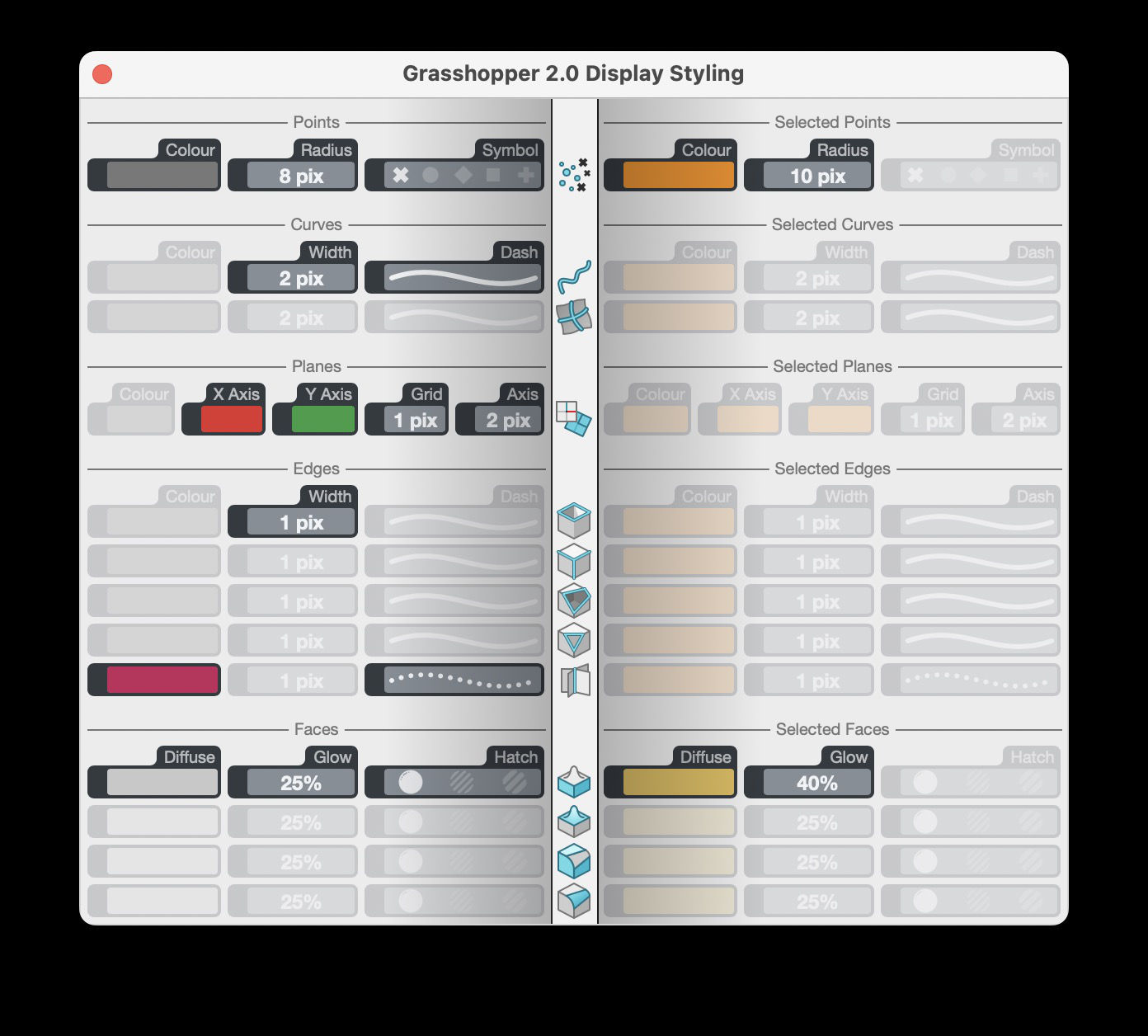
The left half of the window contains all the settings which apply to unselected shapes, while the right half applies to selected shapes. The shape categories (Points, Curves, Planes, etc.) are stacked vertically within these sides and each category has one or more rows for sub-categories. The icons in the middle of the window identify the individual rows, and have tooltips with descriptions of these sub-categories.
Consider for example the Edges category. Grasshopper defines five different kinds of edges, which could all be drawn in different styles. There is a distinction between naked and interior edges, meaning edges which border on either one or two faces. Furthermore edges can be either natural or trimmed, where natural edges follow the limit of the underlying surface while trims cut away a portion of that surface. These two divisions yield a total of four different edge categories, with a special fifth category added for non-manifold edges. Non-manifold edges border on three or more faces and typically indicate invalid topology:
 Naked natural edges
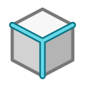 Interior natural edges
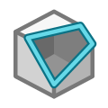 Naked trimmed edges
 Interior trimmed edges
 Non-manifold edges (both natural and trimmed ones)
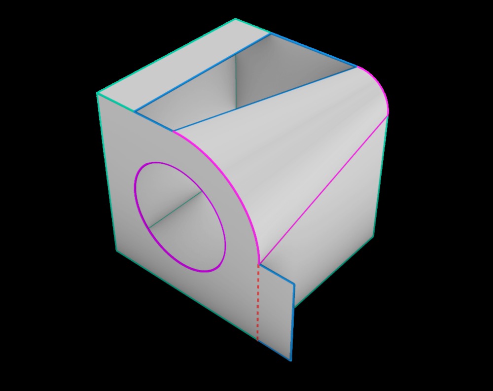
Normally only non-manifold edges are drawn in a unique style, but occasionally it is useful to be able to inspect the edges of surfaces in more detail, in which case display settings differentiating between these different edge categories comes in handy. Figure 2 shows an example of display settings which assign different colours to all five edge categories:
 Naked natural edges
 Interior natural edges
 Naked trimmed edges
 Interior trimmed edges
 Non-manifold edges (also dashed)
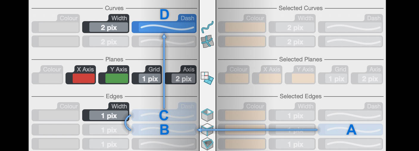
Returning to the display settings interface shown in Figure 1, many of the individual settings are drawn faintly, indicating they are not active. Inactive settings inherit their values from other, more fundamental settings. For example, as the arrows in Figure 3 show, the Dash style of selected interior natural edges (A) derives its state from unselected interior natural edges (B), which in turn derives its state from unselected naked natural edges (C), which ultimately derives its state from unselected curves (D). These blue inheritance arrows will be drawn whenever the mouse hovers over an inactive setting.
Every individual setting has a specific inheritance chain, which terminates whenever an active setting is encountered. Settings can be deactivated by selecting them and pressing the delete or backspace keys. Inactive settings will be automatically reactivated when clicked. Note that some settings are mandatory, in that there are no other settings they could fall back on. As such, these settings cannot be deactivated and must always be active.
A series of tips is available via the Help menu of the Display Settings window, they may come in handy if a quick refresher is needed.
Display Overrides
The aforementioned settings represent the baseline styling for Grasshopper shapes drawn in Rhinoceros viewports. If no other settings or overrides are in effect, the colours, thicknesses, dashes and styles specified there reign supreme. But there are several layers of display overrides, which will supersede the display settings when activated. The simplest of these layers is the parameter-level display override setting, while meta data and display rules add significantly more flexible, targeted and complicated layers.
Parameter Colour Override
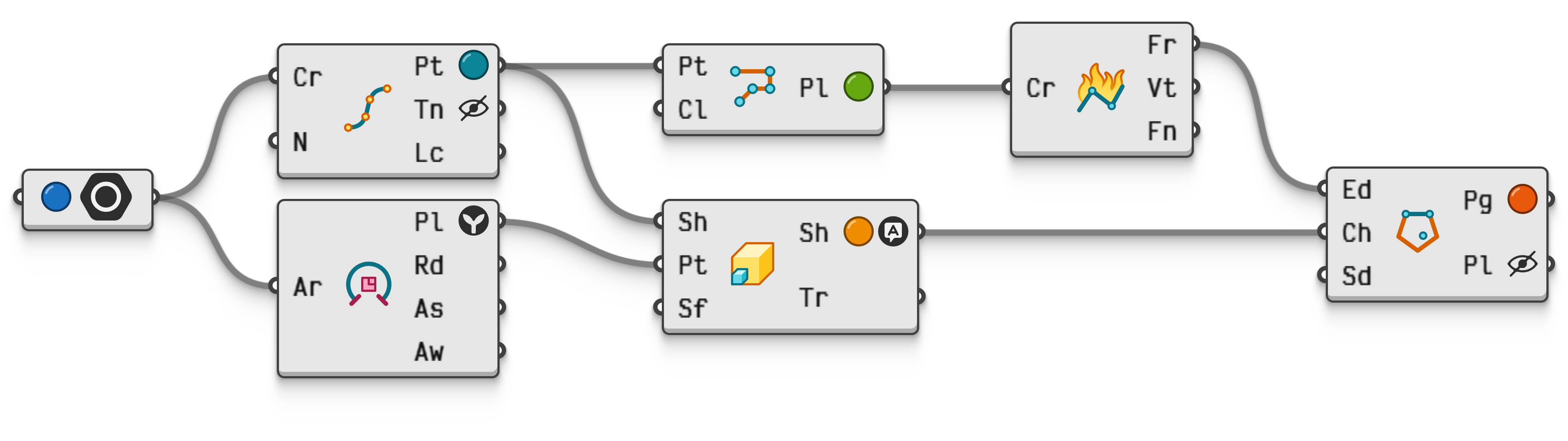
Every parameter containing geometric data has a series of coloured toggles in its menu just underneath the Enabled and Display options as can be seen in Figure 4, which override the colours for all shapes in that parameter while in the unselected state.
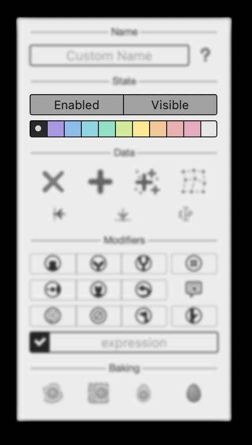
When a colour override is set, a circle with that colour will be drawn next to the parameter name, as per Figure 5. This setting applies equally to all shapes in that parameter, and as such its utility is limited. However, it makes up for that by being exceedingly easy to set, unset and spot.
 Interactive in Grasshopper 2
Meta Data Display Overrides
When more fine grained control over the visualisation of shapes is needed, meta data is the next port of call. Generally speaking, meta data is assigned to values based on the whims and needs of the individual user, according to rules or schemas they themselves decide upon. However, there are a few dozen predefined meta data names which carry meaning within Grasshopper, and some of these can be used to modify the way shapes are drawn. See the Meta Data for a detailed discussion on what meta data is and how it works.
For example, the Display.Colour meta data will set the colour of any single unselected shape. This overrides both the Parameter Colour Override and the application-wide Display Settings.
Meta data overrides for specific shape types are also available, such as Display.Symbol for overriding the symbol used to draw points, or Display.Size for overriding the size of points, or Display.Stroke for overriding the thickness of curves. There are several components in the Meta panel of the Data tab for assigning the most common display override meta data, and the Meta Name Picker object lists all available display related meta data names.
| Name | Type | Effect |
|---|---|---|
Display.Hide |
Boolean |
Hide a shape from view by associating the value false with this meta data name. |
Display.Colour Display.Color |
Colour |
Override the colour of unselected shapes. |
Display.Diffuse |
Colour |
Override the diffuse colour of unselected shaded meshes. |
Display.Glow |
Number |
Override the glow strength (as a percentage) of shaded meshes. |
Display.Symbol |
Text |
Override the symbol used to draw a point. Valid text values include: ● cross● plus● circle● square● diamond● star |
Display.Symbol |
Integer |
Override the symbol used to draw a point. When an integer is supplied, it must be a value from the Rhino.Display.PointStyle enumeration as defined in the RhinoCommon api. |
Display.SymbolAngle |
Angle |
Override the angle for the point symbol. The angle may be specified in any angular unit system. |
Display.SymbolAngle |
Number |
Override the angle for the point symbol. The number indicates a rotation angle in degrees. |
Display.Size |
Number |
Override the primary size of point symbols. |
Display.AltSize |
Number |
Override the secondary size for point symbols which support that setting. |
Display.Stroke |
Number |
Override the width used to draw curves. |
Display.Dashes |
Number |
Override the dash pattern used to draw a curve. The number defines a dash pattern consisting of equally long gaps and dashes. |
Display.Dashes |
Text |
Override the dash pattern used to draw a curve. Valid text values include: ● solid● short● medium● long● varyingThere is also support for number sequences such as "3 1 5 1" or "10,2,5,1,5,2" where the first number controls the length of the first dash, the next number the length of the first gap, and so on. Rhinoceros supports at most eight different lengths per dash pattern. |
Display.Anchor |
Point |
Assign or overwrite anchor points for vectors. Vectors without anchors are not considered geometry and are not drawn. Typically any component which outputs vectors whose position in space is known, automatically includes the correct anchor meta data. |
Display.Arrow |
Text |
Override the styling of vector arrows. Valid values include: ● world where the vector is drawn in world space from tail to tip.● camera where the vector is drawn in camera space starting at the tail, with the arrow length being adjusted based on the camera projection scaling.● screen where the vector is drawn in screen space starting at the tail, with the arrow length in pixels being equal to the vector length in units.● perp where the vector is drawn in screen space perpendicularly to the vector direction, with the arrow tip being at the vector anchor. |
Display.XAxis |
Colour |
Override the colour of the x-axis of planes. |
Display.YAxis |
Colour |
Override the colour of the y-axis of planes. |
Display.ZAxis |
Colour |
Override the colour of the z-axis of planes. |
Display.GridLines |
Integer |
Override the number of grid lines in plane objects. |
Display.Font |
Text |
Override the font used when drawing objects like text dots. Valid values include: ● mono● sans● serif● scriptas well as the name of any installed font. |
Display.FontSize |
Number |
Override the font size used when drawing objects like text dots. |
Display Rules
The most complicated display override layer are the Display Rules, which build upon the concept of meta data as a means of display styling. However, instead of using predefined meta data names, display rules allow for a custom mapping between meta data and display styling. This is done by typing a list of textual instructions into the Display Rules Editor, this approaches what some might call "programming".
Display rules have the highest priority amongst all the overrides, meaning that if the current rules demand a specific colour for a shape, that unselected shape will be drawn in that colour, regardless of meta data overrides, parameter colour overrides, or display settings.
Every display rule set contains a list of instructions, each written on a separate line, either hiding, showing, tinting, or otherwise visually affecting all shapes whose meta data matches a given condition. For example consider a Grasshopper document containing shapes with the meta data name 'Supplier', indicating subcontractors responsible for shipping various elements to site. There will be more than one subcontractor involved, so some shapes may have the meta data 'Supplier=LaplandWoodOy', while others might contain 'Supplier=PrimaSkloSro' or 'Supplier=BetonUndSteinGmbH'. It may be useful to be able to see which shapes have these data, either for analysis or validation purposes. However, performing this inspection using Data Panels or some other non-spatial method is cumbersome and error prone. To visually investigate such meta data in situ, one approach we might take is to only show the shapes which have a 'Supplier' meta data, and then maybe colour code the various individual suppliers. Display rules can encode exactly such an analysis mode:
1. Hide *
2. Show Supplier
3. Tint Supplier = "PrimaSkloSro" -> Blue
4. Tint Supplier = "LaplandWoodOy" -> Brown
5. Tint Supplier = "BetonUndSteinGmbH" -> Magenta
These five instructions achieve the aforementioned display styling. Instruction 1 hides all shapes indiscriminately, after which instruction 2 unhides only those shapes which contain the 'Supplier' tag, regardless of the value assigned to that tag. Later rules always override earlier ones, so the order in which these appear can be very significant. If the Hide and Show instructions were reversed in this case, the display would be entirely empty, as the blanket Hide * instruction cancels whatever hide/show instructions appear before it. Finally, instructions 3, 4 and 5 set the colours of shapes with the three specified suppliers to blue, brown and magenta, leaving all shapes with unmentioned suppliers unaffected. In this particular case, the order of instructions 3, 4, and 5 is not significant, since they target non-overlapping sets of shapes.
For a more in-depth discussion on the various commands, filter syntax and argument syntax of display rule notation, see the Display Rule Syntax topic.