Here are some of the elemental aspects of creating technical documentation for Rhino. Technical documentation includes tutorials, guides and videos in some instances. It is meant to guide McNeelians into having a common language: verbal, visual and stylistic, to produce consistent content for learning Rhino.
What is a Tutorial Guide?
Tutorial Guides are learning-oriented. They describe how to use a combination of Rhino 9 tools, in a workflow, to solve a specific problem. The focus should be on what problem is being solved (for an industry or a specific use-case), rather than on the tools themselves. This changes how you write the guide: it should read as industry-oriented, not Rhino-centric.
Before you start:
- Write a brief outline of what the user will learn.
- Divide it into logical chapters or sections (this becomes your Table of Contents).
There are two types of Tutorial Guides, depending on the audience:
How-To Guides
How-To Guides are step-by-step and aimed at entry-level Rhino users.
- Divide the guide into chapters.
- Add a short description at the beginning of each chapter, explaining what it accomplishes and why.
- Number and describe each step precisely, including keyboard keys pressed and Command Prompt text.
- Use the
unfurlshortcode as much as possible to define UI terms and jargon inline, so a new user is never blocked by an unfamiliar word (see Unfurl).
Workflow Guides
Workflow Guides are explanatory and aimed at users who already have experience with Rhino or Grasshopper. They’re comfortable in the environment (selection, navigation, command workflow, geometry types), so you can describe the process in more natural language.
- Divide the guide into chapters.
- Add a short description at the beginning of each chapter.
- Describe the process as a number of steps that cover the process and outcome, without over-explaining how to accomplish each individual action in Rhino.
Template for Tutorial Guides
The Create an Ergonomic Brush Handle guide is the reference example for the current (v9) tutorial format. New guides should follow this structure.
Front matter
| Field | Purpose |
|---|---|
title |
Full page title. Describe the outcome, not the command (e.g. “Create an Ergonomic Brush Handle”, not “Using Patch”). |
description |
Full-length description used for SEO and unfurl previews. |
short_description |
Short teaser used in card/grid listings. |
authors |
Guide author(s). |
categories |
e.g. ["guides"]. |
disciplines |
Target audience/industry, e.g. ["all", "Product Design"]. |
levels |
"basic", "intermediate", or "advanced". |
tags |
Commands or topics covered, e.g. ["patch"]. |
[page_options] new_style |
Set to true to flag the page as using the current v9 tutorial format (used while both old and new style guides coexist on the site). |
Page structure
- A hero
imageshortcode at the top of the page (see Image). - An intro paragraph that names the commands used and explains the problem being solved, ending with a “Let’s get started!” type of hook.
- Chapters as
##(H2) headings, named after the outcome of that chapter (e.g. “Create the Handle”, not “Using Patch Part 1”). - A one- or two-sentence description under each chapter heading, explaining what the chapter accomplishes before the steps begin.
- Steps as a numbered (
1.) list. Hugo/Markdown auto-numbers these, so every line in the list can literally start with1.. - Sub-steps as a nested numbered list under the relevant top-level step.
- A
figureshortcode after a step whenever a visual result needs confirming (see Figures & Images). - A
call-outshortcode (tipornote) after a chapter’s steps to reinforce a concept — not to repeat a procedure already described in the steps (see Call-outs).
Writing conventions used throughout the reference guide:
- Bold UI element names: button labels, panel names, field names (e.g. Preview, Refine, Domain).
- Use inline code for literal values typed or chosen in a dropdown/option (e.g.
Molded,YAxis,Rainbow). - Bold mouse actions: Right-click, Double-click, Shift-click.
- Quote Command Prompt text exactly, in inline code, e.g.
`Select edges, curves, meshes, pointclouds and points`. - Phrase running a command consistently: “Run the
rhino-commandcommand,” e.g. “Run the Patch
command.”
Patch
command.” - Use the
unfurlshortcode the first time a UI concept, panel, or piece of jargon is mentioned (Command Prompt, selecting objects, toggling a layer, etc.) rather than explaining it inline.
User Interface Setup
Before capturing any visuals for a Tutorial or Workflow Guide:
- Reset the Rhino UI to its default: Window menu > Window Layouts > Default Window Layout.
- Use Rhino’s native Display Modes. This differs from the User’s Guide (below), which uses its own dedicated display modes.
Capturing Visuals
The rules of thumb for capturing visuals:
- Whether a video, clip or an image, the resolution is Full HD (1920 x 1080).
- Preferably use the PNG format.
- Always capture the viewport:
- Strip any user interface elements as most as possible (dialog boxes, command prompt, panels, icons).
- This is primarily due to simplify the localization process.
- See below details on capturing UI elements if need be.
User’s Guide Display Modes
We are using special display modes for capturing visuals. This is specific to the User’s Guide! Tutorial and Workflow Guides use Rhino’s native display modes instead (see User Interface Setup).
Please download these display mode files and import them in  Options
> Diplay Mode page.
Options
> Diplay Mode page.
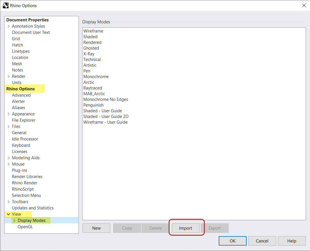
Download from here:
The main changes are that sizes of curves, edges and points have increased. This is so they pop out more when screen capturing. The background color of the viewport has also changed to . (hex #E6E6E6).
User’s Guide Template
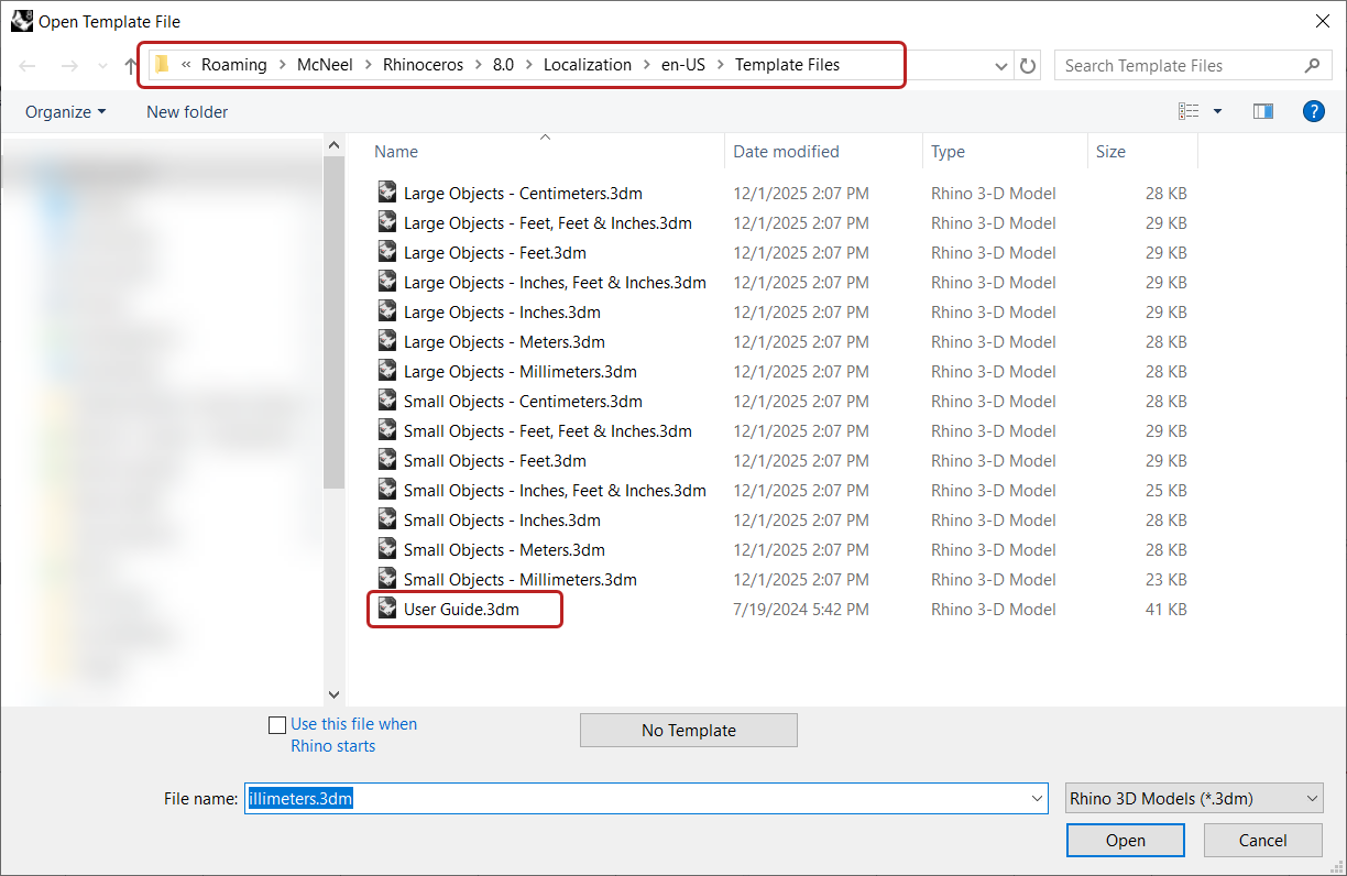
We are using a specific 3dm Template for the User’s Guide. The main change is the Grid Size.
You can add it to Rhino Template Files Folder:
C:\Users\[USER_NAME]\AppData\Roaming\McNeel\Rhinoceros\8.0\Localization\en-US\Template Files
Layer Color Suggestion
TO DO!!
Images
Images are captured in Full HD. Use your capturing program of preference. I recommend Snagit.
Viewports
A few tips & tricks to capture Rhino viewports for Clips:
- Use a 2k or higher res screen, so you can easily capture in Full HD.
- Move Rhino to that screen.
- Maximize the viewport you want to work on.
- Use Snagit or ScreenToGif to define the 1920 x 1080 (Full HD) window.
- Align and center your viewport in it.
- Capture your GIF using ScreenToGIF.
A few tips & tricks to capture Rhino viewports for Images:
- Capture your image using Snagit with the method above or…
- Use ViewportCaptureToFile
Clips (GIFs)
Feel free to capture your GIFs with your prefered capturing program, except for Snagit or Camtasia. Something happens when encoding with these programs that a white background ends up with a yellowish tone.
I recommend using ScreenToGIF!!
Transitions in between images
TO DO!!
Transitions at the end
TO DO!!
Save Settings
TO DO!!
Videos
- Capture in Full HD (1920x1080), minimum 30fps.
- Structure the video like a How-To or Workflow Guide: a logical series of chapters, divided into steps, outlined at the beginning of the video.
- If you show a dialog box or select a setting anywhere in the UI, mention it vocally. Transcriptions and subtitles are generated from the audio, and these need to: be accurately localized by the team, and be understood correctly by LLMs indexing the content.
- Length:
- Short version: ~15 to 20 minutes.
- Long version: ~1 hour, divided into 3 to 4 chapters of ~15 minutes each.
- Recording & Editing:
- Camtasia is recommended.
- Project settings: Resolution 1920x1080, Background Color White.
- Use Fade for all transitions.
- Export to MP4 (File > Export > Local File…).
- Hosting: Vimeo (primarily), YouTube.
Mouse, Keyboard
Capture mouse movement and keyboard strokes with SpotOnTheMouse. Here are the settings used: TO DO.
Panels, Dialog Boxes
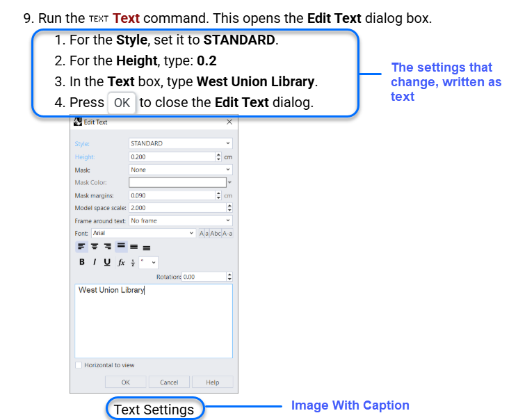
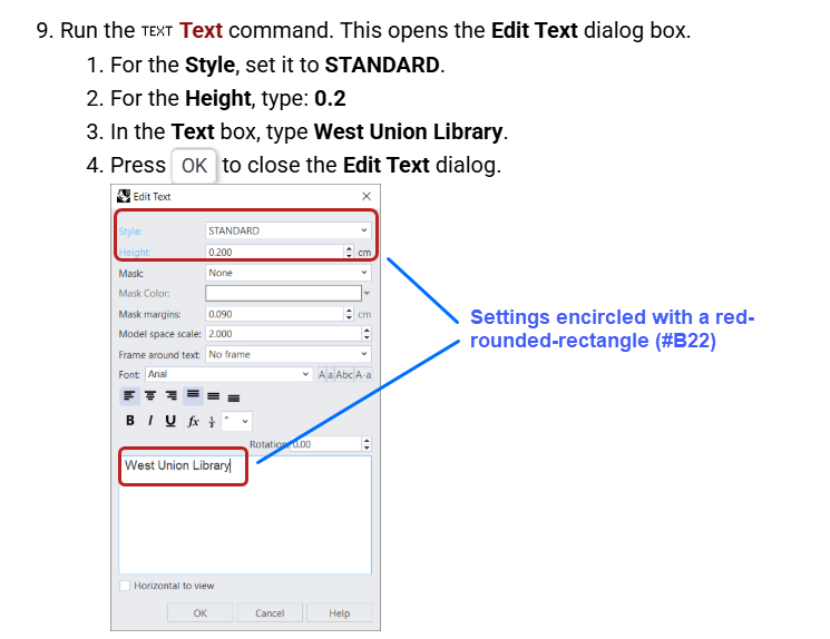
If you do need to add a UI element such as a Panel or Dialog Box, because it simplifies the explanation process of the tutorial, here’s the process to follow:
- Write in text the options of the dialog you’re changing
- You may want to encircle these options with a red rounded rectangle. In this case use
- Capture th dialog.
- Add it beneath the text
- Example 1:
- Example 2:
Annotations
Snagit Quick Styles
TO DO: share annotation styles
Colors
1 1 1 1 1 1
Shortcodes, Unfurls, Snippets
These are the Hugo shortcodes used throughout the reference tutorial (Create an Ergonomic Brush Handle). Copy the patterns below rather than writing raw HTML/Markdown from scratch.
Image
Hero/inline image, resolves relative paths within the page bundle:
{{< image url="images/brush-rendering.png" width="640px" >}}
Figures & Images
Simple step figure:
{{< figure src="images/patch-brush-01a.png" width="500px" >}}
Captioned figure, width-constrained with div:
{{< div style="width:60%" >}}
{{< figure class="figure-no-margins" src="images/patch-brush-02a.png" caption="Note the edge that is set to G2" caption-align="center" no-back=true >}}
{{< /div >}}
Rhino Command
Auto-localizes the command name and adds its icon + link to command help. local-command can be omitted if it’s the same as english-command:
{{< rhino-command english-command="Patch" local-command="Patch" >}}
Unfurl
Defines a UI term or piece of jargon inline as a hover-preview link, so How-To Guides don’t need to explain it in the body text. Use title-override/description-override/image-override to control the preview card instead of relying on the linked page’s own metadata:
{{< unfurl title-override="Select Objects" description-override="Left-click to select an object. Press Shift to add to selection or Control to remove from selection." image-override="https://docs.mcneel.com/rhino/7/usersguide/en-us/images/topic_illustrations/select-005.png" >}}[select](/docs/guides/user-guide/selection/#main-selection-method){{< /unfurl >}}
Viewport
Styled badge for a named viewport:
{{< viewport >}}cam1*{{< /viewport >}}
Badge
Inline colored label, used for continuity states, mode names, etc.:
{{< badge background="#333" >}}G2{{< /badge >}}
Call-outs
Collapsible tip/note boxes. Valid types: note, abstract, info, tip, success, question, warning, failure, danger, bug, example, quote, new.
{{< call-out tip "Changing Continuity" >}} The **continuity dots** can be changed at all times during the Patch command. {{< /call-out >}}
Keyboard
{{< keyboard >}}Enter{{< /keyboard >}}
Awesome (icons)
Font Awesome icon, commonly used before download links:
[{{< awesome "fas fa-download" >}} Patch Brush](patch-brush.3dm)
Grasshopper Component
Links to the Grasshopper component reference with its icon:
{{< gh-component name="Number Slider" page="Params/Number-Slider" icon="Grasshopper/Params/Input/Number%20Slider" >}}
Rhino Icon Link
Icon + labeled link, e.g. a toggle icon inside a panel:
{{< rhino-icon-link name="toggle" url="https://docs.mcneel.com/rhino/9/help/en-us/commands/zebra.htm" icon="gec-toggle.png" >}}
Publishing & Tools
- Guides live on rhino3d.com, built with Hugo, our site generator.
- They’re written in Markdown, with the Hugo shortcodes documented above.
- Tools required for writing and editing:
- A GitHub account.
- Access to the rhino3d.com repo.
- VS Code (editor).
- GitHub Desktop (or another git client) to connect to the repo.