
Style Guide
Below are examples of nearly all the available syntax using Markdown, the table-of-contents , etc.
Stylistic Conventions
There are various stylistic “voices” that can be used when authoring content for this site. Depending on your audience and the context - writing a guide is different from writing a new feature entry - you might employ different “voices,” conventions, different outlines, and even different exercises to get you started.
New Features: The Elevator Pitch
Before doing a video, forum post, blog post, or any new feature content, write down the answers to these simple questions: If you can’t answer them, don’t start creating content. Ask for help!
- Who is the new feature targeted at? Of course many potential users can benefit. But who is ideal? Be specific.
- Why do they want it? What compelling need does the feature satisfy? While there may be many needs, pick the one or two really compelling reasons customers will use the feature. What pain will the new feature make go away? What is a day in their life like both without and with the feature?
- What is the feature’s category (modeling, editing, rendering, export, etc.)?
- What is the key differentiator? Just pick the ONE that is most likely to keep someone’s attention.
- What was the alternative before this feature was available? This doesn’t necessarily mean another vendor’s product. It could be a more painful Rhino workflow.
- How is the new feature different from the alternative?
Armed with the answers, build an outline by filling in the following template to form a single paragraph:
For [ideal user]
who has [problem]
is a [category]that [differentiator].
Unlike [fill in the competitor]
[fill in the key differentiator]
Technical Conventions
Site File Naming
The naming convention for files - guides, samples, etc - is lowercase with - used as spaces. This leads to more consistent and legible URLs. In addition, Google recommends one construct compound URL names with - and not underbars (_). For example, consider the name of this guide: “Style Guide”. The file name for this guide is style-guide. Google treats a hyphen as a word separator, but does not treat an underscore that way. Google treats an underscore as a word joiner—so “red_sneakers” is the same as “redsneakers.”
In general, when considering new file names for guides, please imagine you are saying “Guide to _____”. This often leads to verbs ending in “-ing”, the progressive or continuous verb tense. Obviously, this is not a hard-and-fast rule, but rather a convention.
In general, when considering new file names for samples, please imagine you are saying “_____ sample”. As with guides, this is not a hard-and-fast rule, but rather a general convention.
Division of Content
# Title become H1 headers and are reserved for the title of the page only.
## Header become H2 headers and are reserved for major sections within the page.
### Subheader become H3 headers and are reserved for sub-sections within a major section.
Fonts
On Windows & macOS, this site attempts to use the Roboto typeface family and falls back to a sans-serif variant per OS if Roboto is not found. For typical body copy, Roboto is used with the following properties (font size: 16 px, font weight: 400, line height: 1.5). Specific heading and additional font properties are set within a CSS file.
Paths & Filenames
*Italics* are used to denote filenames, paths, and file extensions. For example:
Navigate to C:\Program Files\Rhinoceros 5 (64-bit)\Plug-ins.
Bold
**Bold** (strong emphasis) is used in instructions to highlight critical instructions that are very important. Bold should be used sparingly as it is often present in headers as natural division of content.
Spelling & Case
The following spelling and case conventions are adopted on this site:
- “3D” is not hyphenated and D should be capitalized (not 3-D, 3-d, nor 3d).
- “Rhino 3D” has a space between Rhino and 3D (not Rhino3D, Rhino3d, Rhino-3D, Rhino-3d, Rhino3-D, nor Rhino3-d).
- “plugin” (plural plugins) is not hyphenated (plug-in and plug-ins are incorrect), unless it refers to a place in the Rhino UI where it is hyphenated.
- “BREP” (plural BREPs with a lowercase s) is always capitalized without a hyphen (not BRep, B-Rep, Brep, B-rep, brep, nor b-rep).
- “openNURBS” (not OpenNURBS, nor opennurbs, nor oPeNnURBs) unless it refers to a namespace in code where it is capitalized, or a path where it is not.
Spacing & Punctuation
- Use one (1) space after end-of-sentence punctuation, not two (2) or more spaces (digital typography convention).
- Use one (1) space after a bullet point, unless two (2) spaces are used to help the spacing “breathe.”
- Periods and commas should go inside of quotation marks (American convention).
- Headings should always use title case where the first letter of main words are capitalized (This is Title Case and Correct. This is sentence case and incorrect).
- Headings should not use a colon (:) at the end, unless transitioning to paragraph text on the same line.
- Paragraph text should include an end-of-line colon to introduce a list on subsequent lines.
- 2-part headings should use a colon to separate primary & secondary info, but don’t use a colon twice (Primary: Secondary).
- 3-part headings should use a pipe (|) with a space on both sides then a colon with a space afterward (Primary | Secondary: Tertiary).
Images & Screenshots
Please use image names without spaces (use a hypen - NOT an underscore - for word separation). It is also safest to use lowercase filenames and extensions.
When feasible, it is best to use the .svg vector format for images, especially for diagrams.
When using bitmap images, the preferred format is .png, but any browser-friendly bitmap format will work.
When capturing screenshots, consider that many people have high-DPI (aka: “Retina”) displays. Please capture all screenshots on a high-DPI display.
See the Text Modifiers > Images section of this guide for more information on inserting images.
Headers
Headers demarcate major sections of the page, guide, etc.
Headers are created like this:
## Headers
The example above is an H2 header.
Creating a header automatically creates an #anchor tag in the generated html.
For headers with multiple words, the markdown parser lowercases all the words, removes non-alphanumeric characters and adds dashes for spaces. For example, if we had a header like this:
## This Is My Header
the resulting html anchor tag would be:
#this-is-my-header
Read more about anchors here.
Subheaders
Subheaders demarcate sub-sections–a major section underneath a header.
Subheaders are created like this:
### Subheader
The example above is an H3 header, which we are calling a “Subheader.”
Just like with H2 headers, H3 headers also create an #anchor tag in the generated html.
Heading Anchors
Anchors are auto generated from heading texts. They’re formatted to be URL-safe. In cases that it’s really needed, an additional anchor tag can be specified.
Language
Anchors are automatically generated by parsing the English version of the heading text and formatting it to be URL-safe.
For example a heading text in fr\index.md that reads Grands projets will look for a corresponding heading in en\index.md to find Large Projects and format it to:
#large-projects
Formatting
In the process of sanitizing the heading text to generate anchors, all characters will be lowercased. Spaces will be replaced by - and special character will be removed.
For example a heading reading:
### This & That
becomes:
#this--that
-1, -2 and so on.Optional Explicit Anchors
Optionally, an additional anchor with explicit ID can be specified using anchor shortcode (does not replace auto generated heading anchors). This can be useful for making sure lagacy links to headings work when migrating from another existing system to Hugo.
For example below heading in markdown:
### Heading Text {id="custom_anchor"}
Will generate two anchors:
#heading-text
and
#custom_anchor
The UI-widget to the left of this column is a the Table of Contents (TOC) for this page. If you are authoring a page that requires a TOC, you can generate one automatically by toggling the toc = true frontmatter field (see How This Site Works for more information).
For example, to get a Header to show up in the TOC, you would type this:
## Cool Header
To get a Subheader to show up in the TOC, you would type this:
### Sweet Subheader
Structural Elements
Paragraphs
Consecutive lines of text are considered to be one paragraph. You must add a blank line between paragraphs.
Block Quotes
A blockquote is started using the > marker followed by an optional space; all following lines that are also started with the blockquote marker belong to the blockquote. You can use any block-level elements inside a blockquote:
> This is a sample block quote
>
> >Nested blockquotes are also possible.
Yields:
This is a sample block quote
Nested blockquotes are also possible.
Code Blocks
To create a code block, surround the code with three back-ticks, followed by a language abbreviation. For example:
```
…followed by the code…
|
|
…and finally closed by three back-ticks.
The abbreviation after the first set of back-ticks is the language code for syntax highlighting. We are using a syntax highlighting built into Go’s Chroma Highlighting engine. Many languages are supported. The most common language abbreviations used on this site are:
csis C#vbnetis Visual Basicpythonis Pythoncppis C/C++
A complete list of language aliases can be found in the List of Chroma Highlighting Languages.
Horizontal Rules
Horizontal rules (lines) are created by using three dashes:
---
You can an example of one of these right here…
Lists
You can create ordered lists and unordered lists.
Ordered Lists
Ordered lists are created by typing 1. at the start of a line, like this:
This is an ordered list:

1. Item one.
1. Item two.
1. Item three.
yields:
This is an ordered list:
- Item one.
- Item two.
- Item three.
Nested ordered lists are also possible. For example:
This is a nested ordered list:

1. Do item one.
   1. Item one subtask one.
   1. Item one subtask two.
1. Do item two.
1. Do item three.
yields:
This is a nested ordered list:
- Do item one.
- Item one subtask one.
- Item one subtask two.
- Do item two.
- Do item three.
Unordered Lists
Unordered lists (bullet lists) are created using the dash (-) symbol at the beginning of a line:
This is a bullet list:

* Item one
* Item two
* Item three
yields:
This is a bullet list:
- Item one
- Item two
- Item three
Tables
markdown supports a syntax for creating simple tables. A line starting with a pipe character starts a table row. However, if the pipe characters is immediately followed by a dash (-), a separator line is created. Separator lines are used to split the table header from the table body (and optionally align the table columns) and to split the table body into multiple parts. If the pipe character is followed by an equal sign (=), the tables rows below it are part of the table footer.
Here is the syntax for a simple table:
| Header1 | Header2 | Header3 |
|:--------|:-------:|--------:|
| cell1   | cell2   | cell3   |
| cell4   | cell5   | cell6   |
| cell7   | cell8   | cell9   |
yields:
| Header1 | Header2 | Header3 |
|---|---|---|
| cell1 | cell2 | cell3 |
| cell4 | cell5 | cell6 |
| cell7 | cell8 | cell9 |
HTML Elements
markdown allows you to use block-level HTML tags (div, p, pre, etc) to markup whole blocks of text – just start a line with a block-level HTML tag.
Here is an example of using HTML elements:
<div style="float: right">
Something that stays right and is not wrapped in a para.
</div>

<div>
This is wrapped in a para.
</div>
<p>
This can contain only *span* level elements.
</p>
yields:
This can contain only *span* level elements.
Text Modifiers
Emphasis
Emphasis (bold and italic) can be added to text by surrounding the text with asterisks:
For example:
I like *my* coffee **bold**.
yields:
I like my coffee bold.
Links
Simple Links
A simple link can be created by surrounding the text with square brackets and the link URL with parentheses:
This is a [link](https://www.rhino3d.com) to
yields:
This is a link to the Rhino 3D homepage.
You can also add title information to the link:
A [link](https://www.rhino3d.com "Rhino 3D homepage") to the homepage.
yields:
A link to the homepage.
There is another way to create links which does not interrupt the text flow. The URL and title are defined using a reference name and this reference name is then used in square brackets instead of the link URL:
A [link][rhino3d homepage] to the homepage.

[rhino3d homepage]: https://www.rhino3d.com "Modeling tools for designers"
yields:
A link to the homepage.
If the link text itself is the reference name, the second set of square brackets can be omitted:
A link to the [Rhino3D homepage].

[Rhino3D homepage]: https://www.rhino3d.com "Modeling tools for designers"
yields:
A link to the Rhino3D homepage.
Anchor Links
As discussed above, Headers and Subheaders automatically create anchors in the resulting rendered html output.
You can link to any anchor within a page using the hash # symbol in a normal link. For example:
[Subheaders](#subheaders) automatically create anchors in the resulting rendered html output
yields the sentence fragment shown above.
To create new anchors within the site, you can use html inline. For example:
<a id="top"></a>
was added to the top of this page.
Links with previews
Links wrapped in unfurl shortcode will try to show a preview of the link og meta data on hover. This only works for links to other pages on rhino3d.com and other mcneel sites that we configure for this purpose.
For example
{{< unfurl >}}[docs link](https://docs.mcneel.com/rhino/8/help/en-us/commands/clippingdrawings.htm){{< /unfurl >}}
will produce docs link which shows a preview when you hover over it.
You can optionally override the title, image and description that gets shown in the popup by providing the additional arguments. For example:
{{< unfurl title-override="...h" description-override="..." image-override="https://..." >}}[Rhino3D homepage](https://www.rhino3d.com){{< /unfurl >}}
produces Rhino3D homepage
-
For some of our sites, you may only see the unfurled content after your changes are live. This is because of CORS. You only should link to content that is hosted by us so we can have control over this.
-
To easiest way to see what the meta tags look like for a given link is to slack it to yourself and see the unfurled link.
Inline Code
Text phrases can be easily marked up as code by surrounding them with back-ticks:
To write a line to the command line use the `Rhino.RhinoApp.WriteLine` method.
yields:
To write a line to the command line use the Rhino.RhinoApp.WriteLine method.
HTML Elements
HTML is not only supported on the block-level but also on the span-level:
This is <span style="color: red">written in red</span>.
yields:
This is written in red.
MathJax & LaTeX
markdown has support for LaTeX to PNG rendering via MathJax.
For example:
$$y = {\sqrt{x^2+(x-1)} \over x-3} + \left| 2x \over x^{0.5x} \right|$$
yields:
$$y = {\sqrt{x^2+(x-1)} \over x-3} + \left| 2x \over x^{0.5x} \right|$$
See the MathJax basic tutorial and quick reference on StackExchange.
Images
Images can be created in a similar way to links: just use an exclamation mark before the square brackets. The link text will become the alternative text of the image and the link URL specifies the image source:

yields:

Alternative, you can use the image shortcode as well, which accepts arguments for url, alt, width, and height.
Shortcodes
Shortcodes are Hugo’s way of inserting a html into your content that generate some special type of formatted output. Hugo comes with some built-in shortcodes for things like inserting Vimeo or YouTube videos, Instagram or Twitter posts, etc. but we can author our own shortcodes to suit our needs.
- Shortcodes are very picky about formatting: even the slightest missing brace can cause the site not to deploy. Don’t worry, you won’t break the site, you just won’t see your change go live until it is fixed.
- Shortcodes only work when used in the content of a post, not in the frontmatter. You may be tempted to use them in the frontmatter, but they don’t work there.
- If you are referencing images, pease make sure to only use files with lowercase names and NO SPACES!
So far, we’ve got the following shortcodes of our own:
3dm
Use the 3dm shortcode to embed a 3D view of a 3dm file to a page.
{{< 3dm path="path_to_file.3dm" camera=`{"x":0,"y":50,"z":50}` width="80%" height="400px" >}}
yields:
and
{{< 3dm path="path_to_file.3dm" width="80%" height="400px" background="transparent" settings=`{"controls":false, "camera":{"type":"orthographic", "zoom":8}}` animation=`{"frames":[{"title":"perspective","camera":{"x":10,"y":-30,"z":10},"layers":"*"},{"title":"right","camera":{"x":0,"y":40,"z":5},"layers":"*"},{"title":"front","camera":{"x":40,"y":0,"z":5},"layers":"*"}]}` >}}
yields:
Required Arguments:
path: string. Path to the 3dm file, for example file residing in the same folder as .md content file could be renference aspath="example.3dm".width: String. Pixel or Percentage value for width of the element.height: String. Pixel or Percentage value for height of the element.
Optional Arguments:
camera: JSON. XYZ Position of the camera. Example:camera=`{"x":0,"y":50,"z":50}`background: String. Background color of the viewer. Example:background="transparent"title: String. Text overlay at the bottom of the element.text_color: String. Text color of the title. Example:text_color="red"settings: JSON. General settings for the viewer. Example:settings=`{"controls":false, "camera":{"type":"orthographic", "fov":50, "zoom":8}}`animation: JSON. Flip trhough set of predefined cameras, titles (TODO: and layers). Has two sub-objects;settingsandframes. Example:animation=`{"settings":{"repeat":1, "eachDelay":2, "eachDuration":2}, "frames":[{"title":"left","camera":{"x":10,"y":-30,"z":10},"layers":"*"},{"title":"right","camera":{"x":0,"y":40,"z":5},"layers":"*"},{"title":"front","camera":{"x":40,"y":0,"z":5},"layers":"*"}]}`
Anchor
Creates an empty div with the specified ID and can be used as an #anchor anywhere in the page:
{{< anchor "custom_anchor" >}}
produces an empty div above this line, and can be referenced with a link #custom_anchor
Awesome (Font Awesome)
Font Awesome provides a huge library of vector icons that area easy to use with this sortcode:
{{< awesome fas fa-check small >}} produces:
You can also specify a size and a color like this:
{{< awesome id="fab fa-windows" size="small" color="#49abe9" >}} produces:
Badge
Adds a round background around text.
For example: {{< badge background="#30ab8a" >}}1{{< /badge >}} produces: 1
For a bordered pill with colored text, e.g. a course level: {{< badge background="#2f8a34" outline="true" >}}Beginner{{< /badge >}} produces: Beginner
Optional Arguments:
background: color. Fill color, or the text and border color of an outline badge. Default:#900.outline="true": bordered pill instead of a filled circle.
BeforeAfter
You can create image-based before-and-after comparisons with the following shortcode:
{{< beforeafter "/images/before.png" "/images/after.png" >}}
produces:
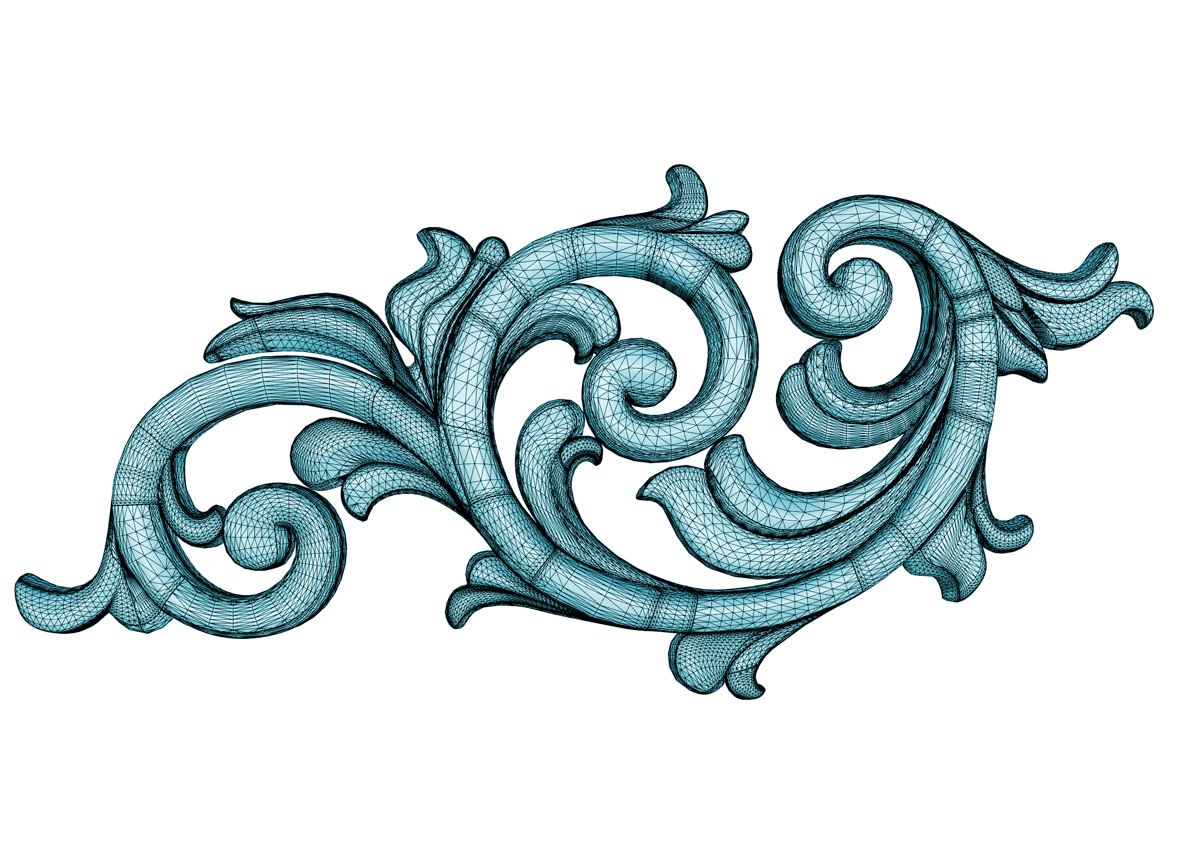
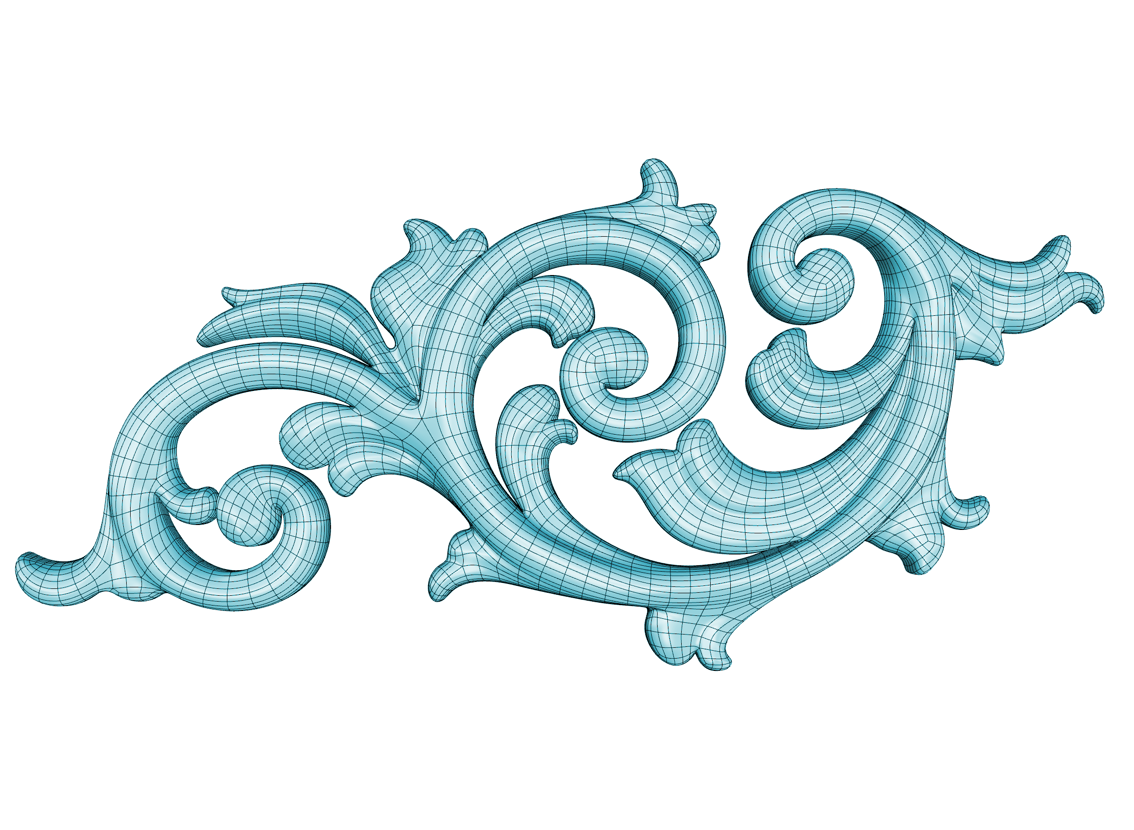
You can also supply optional captions for the left and right images like this:
{{< beforeafter "/images/before.png" "/images/after.png" "This text at left" "This text at right" >}}
This shortcode uses the twentytwenty jQuery widget.
Button
A link styled as the site’s pill button (the one on the homepage price cards). The label is the body, so it is translated with the page; add your own arrow if you want one.
{{< button link="/learn" >}}Start course →{{< /button >}} produces: Start course →
{{< button link="/learn" secondary="true" >}}Learn more{{< /button >}} produces: Learn more
Required Arguments:
link: string. Where the button goes. A site-root path to a page (/learn2/) resolves to that page’s URL in the current language, exactly like a markdown link; external URLs,#anchorsand files pass through.
Optional Arguments:
secondary="true": quiet outline style, e.g. for a Learn More next to a primary button.block="true": full width of its container, as at the bottom of a Card Container.new-tab="true": opens in a new tab.
Call-Out
To call attention to a specific area of content on the page, use the call-out shortcode.
For example:
{{< call-out danger "Here Be Dragons" >}}
Don't click that button man...it's dangerous dude.
{{< /call-out >}}
produces:
The following arguments can be passed to the shortcode to determine the type:
-
note -
abstract -
info -
tip -
success -
question -
warning -
failure -
danger -
bug -
example -
quote -
new -
accordion: an FAQ item, see below.
Optional Arguments:
title: string. Default: the type’s name.open: bool. Every type is open unlessopen=false; onmodern_stylepages call-outs are always open.accordionis the other way round: closed unlessopen=true.
Accordion
type="accordion" is the FAQ item from the Learn / Teach pages: a grey rounded rectangle with a red + that turns into a cross when opened, the answer unfolding inside the same box. It starts closed, stays collapsible on modern_style pages, and several in a row make an accordion.
{{< call-out type="accordion" title="Why does my Boolean operation fail?" >}}
Booleans need clean, correctly intersecting geometry. Run Check and ShowEdges first.
{{< /call-out >}}
{{< call-out type="accordion" title="My fillet won't build, what can I do?" >}}
Try a smaller radius, fillet fewer edges at once, or rebuild the underlying surfaces first.
{{< /call-out >}}
produces:
Card Gallery
Wraps cards in a responsive grid that adds columns as the page gets wider. Use it around Card Containers, Feature Cards, Price Cards or Market Cards:
{{< card-gallery >}}
{{< feature-card page="/features/shrinkwrap/index.md" >}}
{{< feature-card page="/features/display/metal/index.md" >}}
{{< /card-gallery >}}
produces:

Optional Arguments:
columns: 1–6. Fixed number of columns instead of as many as fit, e.g.columns="2"for half-width text cards. Still drops to two columns on tablets and one on phones.
Card Container
A box for whatever you put in it. Border, corner radius, shadow, hover effect, padding and background are arguments; the content is markdown. It is the building block for the card designs on the Learn pages. Put several in a Card Gallery to make a grid.
{{< card-gallery columns="3" >}}
{{< card-container >}}
### [Level 1 - Training Manual](/learn)
A complete introduction to 3-D modeling in Rhino: interface, precision tools, curves, surfaces, and layouts.
{{< badge background="#2f8a34" outline="true" >}}Beginner{{< /badge >}} ~24 hrs
{{< button link="/learn" block="true" >}}Start course →{{< /button >}}
{{< /card-container >}}
{{< /card-gallery >}}
produces:

A complete introduction to 3-D modeling in Rhino: interface, precision tools, curves, surfaces, and layouts.
Beginner ~24 hrs
Nothing about the content is an argument; where something sits in the body decides what it is: a picture as the first block is the flush media, a lone Font Awesome icon first is the accent icon, headings are titles (a linked first heading or a linked first picture makes the whole card clickable), and a trailing Button, Hotlink or Badge, or a --- before the last block, is pinned to the bottom. There are no layout arguments: put things side by side with Row and Column (wrap, column width), center text by wrapping it in Center, and letterbox a picture instead of cropping it with the Image shortcode and class="contain". Every design and argument is shown on the Card Container page. Inside a row / column the same rules apply per column: a trailing button, hotlink or badge is pinned to the column’s bottom (level with a picture beside it), and a picture in a column is an inset picture with the card’s corner radius.
Optional Arguments:
radius:none|small|medium|large. Default:medium.border:thin|none|accent. Default:thin.shadow:none|always. Default:none.hover:none|shadow|lift|accent. Default:shadowwhen the card is clickable,noneotherwise.padding:none|small|medium|large. Body only; the media picture is always flush. Default:medium.background:white|gray|transparent. Default:white.link: string. Makes the whole card clickable without a linked title. The first heading’s text names the link.class: string. Extra class names.
Feature Card
A linked picture card: thumbnail, title and a one-line description, read from the front matter of the page you point it at (thumbnail, title, short_description). It is the card used for the features on /8/new and in the Learn Rhino section of the homepage. Always put it inside a Card Gallery.
{{< feature-card page="/features/shrinkwrap/index.md" >}}
produces:
Everything on the card can be overridden, so it can point anywhere, not only at the page it reads from. This is how the homepage builds its Learn Rhino cards:
{{< feature-card page="/learn/_index.md" url="/learn/?query=kind:%20jump_start" title="Getting Started" description="Jump right in at your comfort level" image="/images/getting-started.jpeg" >}}
produces:
Required Arguments:
page: string. Path of the content file the card reads its defaults from, e.g.page="/features/shrinkwrap/index.md". Required even when you override everything else.
Optional Arguments:
url: string. Link target. Default: the page’s URL.title: string. Default: the page’stitle.description: string. Default: the page’sshort_description, cut to 75 characters. A feature updated in the latest Rhino version shows itswhats_newsummary instead.image: string. Either a file in the site-wide/images/folder (image="/images/getting-started.jpeg") or the name of an image next to the referenced page (image="thumbnail.png"). Default: the page’sthumbnail. Images are cropped to 800×450.
Align
{{< align left >}}Left Wing{{< /align >}}
{{< align center >}}Centrist{{< /align >}}
{{< align right >}}Right Wing{{< /align >}}
produces:
Center
Use the center shortcode to center images, text, etc. in the div.
For example:
{{< center >}}
This text is centered
{{< /center >}}
produces:
You can center images too using the image argument like this:
{{< center image >}}

{{< /center >}}
produces:

Checklist
A markdown list whose bullets are red check marks. Wrap an ordinary list; nothing else changes. Used for the text cards on the Learn pages.
{{< checklist >}}
- **Market visibility** - listed in the official Rhino Custom Training directory.
- **Exclusive resources** - instructor-only webinars and regional support.
{{< /checklist >}}
produces:
- Market visibility - listed in the official Rhino Custom Training directory.
- Exclusive resources - instructor-only webinars and regional support.
For empty checkboxes use a markdown task list instead (- [ ] item); the site already styles those. It takes no arguments.
Currency
The currency symbol of the visitor’s sales region: $ for NAPA, ASIA and LATA, € for EMEA, ¥ for JAPAN. It is the currency entry of the region’s table in data/pricing/en.toml.
{{< currency >}}195 produces: $195
For a complete price prefer Price, which also gets the number and the language’s formatting right.
Command
Command What’s New
Discourse Gallery
Use the discourse-gallery shortcode to embed a Discourse gallery with thumbnails as an iframe.
{{< discourse-gallery category="136" per-page="3" top-period="all" >}}
produces:
Arguments:
category: Number. Restrict topics to a single category. Pass the id of the target category.tags: String. Restrict topics to those associated with this tag.per-page: Number. Controls how many topics to return. We suggest multiples of 3.template: String. Eithercomplete(default) orbasicWhile basic is just a list of topic titles, the complete template brings title, user name, user avatar, and topic thumbnail.top-period: String. One ofall(default),yearly,quarterly,monthly,weekly,daily.
[page_option] discourse_gallery = true. Doing so will load the necessary javascript in the page’s footer.Figure
Use the figure shortcode to insert images with captions like this:
{{< figure src="/images/light-falloff-after.png" caption="Lights have a falloff value that can be set to inverse squared which mimics how light fades with distance." caption-align="center" >}}
produces:
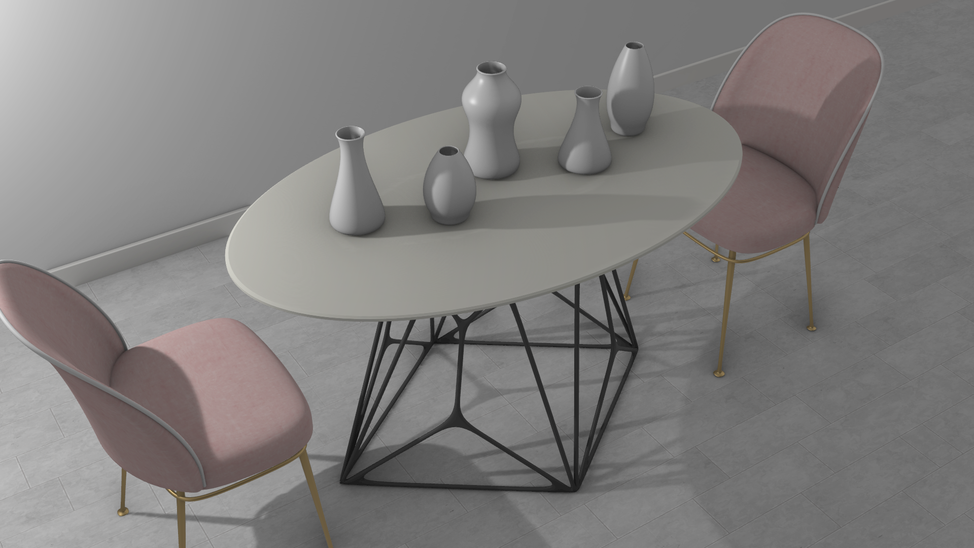
Optionally, you can also use the gallery and load-photoswipe shortcodes to embed figures in a gallery and pop-up an image overlay when users click or tap on the image.
Gallery
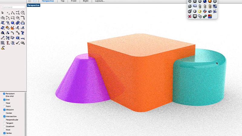
The gallery shortcode used to show multiple images in a thumbnail grid. It is used in conjuction with the figure and load-photoswipe shortcodes like this:
{{< gallery >}}
  {{< figure src="/images/quadremesh-thumbnail.png" caption="Horse mesh retopologized" >}}
  {{< figure src="/images/pbr_material.png" caption="A PBR Material" >}}
  {{< figure src="/images/project.jpg" caption="Look! A toaster!" >}}
{{< /gallery >}}
{{< load-photoswipe >}}
produces:

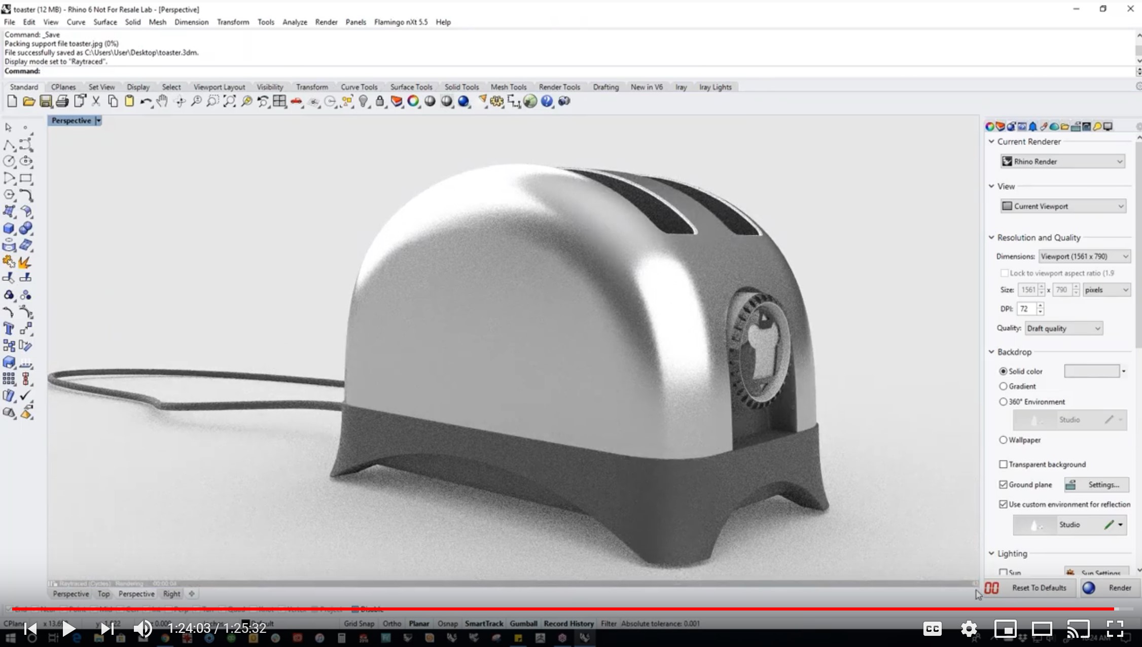
This shortcode uses the hugo-easy-gallery shortcode, along with Photoswipe.
Hover-card grid
Pass hover-card="true" to render a fixed-column grid (3 columns by default, use columns to change it) where each tile’s title sits over the image and its caption folds out below the tile as a description on hover or keyboard focus, styled like the site’s unfurl link-preview tooltip. Keep caption to about two short sentences — it isn’t truncated, so longer text will just make the popover taller. This mode ignores caption-position, caption-effect, and hover-effect. On narrow screens the grid collapses to a single column and the description is always shown instead of folding out.
{{< gallery hover-card="true" >}}
  {{< figure src="/images/quadremesh-thumbnail.png" title="Retopology" caption="Horse mesh retopologized into a clean quad layout for animation." >}}
  {{< figure src="/images/pbr_material.png" title="PBR Material" caption="A physically based material rendered in the Rhino viewport." >}}
  {{< figure src="/images/project.jpg" title="Toaster" caption="Look! A toaster! Modeled entirely from NURBS surfaces." >}}
{{< /gallery >}}
produces:
| Parameter | Default | Notes |
|---|---|---|
| hover-card | false | Set to "true" to enable the grid-with-hover-description layout described above. |
| columns | 3 | Number of grid columns on wide screens (only used when hover-card="true"). |
Hotlink
This is a link aligned to the right used as a link for additional information about a specific topic. It is removed when printed. As an example:
{{< hotlink >}}
[Link Text](Link)
{{< /hotlink >}}
Image (shortcode)
There is a basic image shortcode for doing simple sizing (this is an html resizing, not an actual image process - see imgproc below)…
Here is an example that changes the width of an image
{{< image url="logo.png" width="250px" >}}
produces:
Image Accordion
Use image-accordion with nested image-accordion-item shortcodes to create an interactive feature showcase: a full-bleed background image or video with a frosted-glass expandable menu on the left.
{{< image-accordion >}}
{{< image-accordion-item title="Feature one" image="images/photo.jpg" >}}
Short description of this feature.
{{< /image-accordion-item >}}
{{< image-accordion-item title="Feature two" image="images/photo2.jpg" >}}
Short description of this feature.
{{< /image-accordion-item >}}
{{< /image-accordion >}}
The image parameter can be a page-bundle image path, an absolute URL, or a video URL (.mp4, .webm, .ogg, .mov). Video backgrounds autoplay muted and looped.
yields:
| Parameter | Shortcode | Default | Notes |
|---|---|---|---|
| full-bleed | image-accordion | false | Set to "true" to stretch the component to the full viewport width. Only use this on pages where the content area is centered in the viewport (no TOC sidebar), otherwise the component will overflow the page. |
| title | image-accordion-item | Menu label; also shown bold in the description | |
| image | image-accordion-item | URL to an image or video (.mp4, .webm) |
Image Processing (imgproc)
Hugo comes with a number of useful image processing routines like resizing and cropping. It’s important to understand that these are not just css styles, but actual processes the generate entirely new derivative files based on the image you use as your input. This is especially useful for generating thumbnails from large images so that a smaller (in kb) image is delivered in those situations where a larger one would cause slow pageloads. Think of these image processing routines as the equivalent of opening up your file in a program like Photoshop and performing resizing, format, or cropping operations on them.
To use the Image Processing routines on the page, use the imgproc shortcode.
Here is an example that resizes an image:
{{< imgproc "logo.png" "Resize" "48x48" >}}
Make sure you close the final brace (not shown above, unfortunately) with a forward slash / like this…
/>}}
produces:

Latest Rhino Version
Avoid writing the latest Rhino version in text. Instead, the site itself knows which is the current shipping version. So use the following shortcode:
{{< latest-rhino-version >}} produces: 8
Learn
Renders a “What you’ll learn” callout, used at the top of modern_style guide pages (right after the front matter, before the intro paragraph) to summarize the skills the tutorial covers.
Call it with the percent form so the inner markdown, and any nested shortcodes like rhino-command, are fully rendered. Write the items as a normal bulleted or numbered markdown list between the tags.
For example:
{{% learn %}}
- Generate 4 and 5-sided surfaces with {{< rhino-command english-command="Patch" local-command="Patch" >}}, controlling continuity on each edge.
- Evaluate surface transitions with {{< rhino-command english-command="Zebra" local-command="Zebra" >}} analysis.
{{% /learn %}}
produces:
What you'll learn
 Patch
Patch Zebra
ZebraOptional Arguments:
title: string. Default:"What you'll learn". Renders as a<p>, not a heading, so it stays out of the table of contents and section numbering.
Load Photoswipe
The load-photoswipe shortcode loads the javascript libraries on this page in order to support clicking or tapping on an image to show a lightbox-style image overlay. You only need to call it once per page like this:
{{< load-photoswipe >}}
and the library will load.
Keyboard
Adds styling around text to make it look like a keyboard key.
For example: {{< keyboard >}}Enter{{< /keyboard >}} produces:
You can put anything between the opening and closing tags. Here are some common keys:
New Label
Use the New Label along with the included_in.since frontmatter field to create version-specific “new” labels.
Standard Size:
{{< new-label 6 >}} produces:
Small Size:
An inline {{< new-label 6 small >}} small new label produces:
An inline
small new label. There’s a bug here that causes a line-wrap in the middle. Brian doesn’t know how to fix it.Bullet in List:
  * {{< new-label 6 bullet >}} Feature description
  * A feature from a previous version
  * {{< new-label 7 bullet >}} A feature from a previous version
produces:
- Feature description
- A feature from a previous version
- A feature from a previous version
Nugget
Define a Nugget
The following puts a hidden marker into the rendered HTML that can be used in later parsing. The nugget begins immediately after the marker, and ends at the next nugget definition. If no other nugget is defined, the nugget goes to the end of the file.
{{< nugget name='[NUGGET-NAME]' >}}
CAUTION: embedded videos don’t work in nuggets unless you use the {{< local-video >}} shortcode.
Include the Nugget:
{{< include-nugget src="../../path/to/topic/index.md" name='[NUGGET-NAME]' >}}
This will insert the nugget into the documet at this location.
Open Rhino
To open URL in Rhino, use the:
{{< open-rhino
    "Clip.3dm"
    "Open Clip.3dm in Rhino"
     />}}
to produce:
Open Clip.3dm in RhinoThe file URL should be relative to the index.md file you’re referencing it from. Alternatively you can use a full URL starting with http
To open Rhino by clicking an image:
{{< open-rhino "Clip.3dm" >}}

{{< /open-rhino >}}
Page Break
Manual Page Breaks can be inserted by this shortcode:
{{< page-break >}}
<p style="page-break-after: always;"> </p>
<p style="page-break-before: always;"> </p>
\rhino3d.com\themes\rhino3d.com-theme\assets\scss_print.scss
  h3, h4 {
    page-break-after: avoid;
  }
  pre, blockquote {
    page-break-inside: avoid;
  }
  div.details {
    page-break-inside: avoid;
    page-break-before: avoid;
  }
Page Search
Create a search bar to search through the contents of the page. Use shortcode below:
elementsis a list comma separated list of html elements.weightsis their corresponding importance in the search results.
{{< page-search elements="h1, h2, h3, search-tag" weights="5, 1, 20, 100" >}}
to produce:
Price
A price from the site-wide price table, inline. Same lookup as Price Card: the row named by type, for the visitor’s sales region, written the way the page’s language writes prices. Plain text, so it works inside bold, links and headings.
Rhino costs {{< price "commercial" >}}, or {{< price "commercial-upgrade" >}} to upgrade. Students pay **{{< price type="edu" >}}**.
produces:
Rhino costs $995, or $595 to upgrade. Students pay $195.
Required Arguments:
type: string, positional or named. Row ofdata/pricing/en.toml:commercial,commercial-upgrade,edu,edu-upgrade,eval, and the Buy page keys such asrhino-10orbongo. An unknown type renders a visible error.
To add or change a price, edit data/pricing/en.toml (and the language file that overrides it, if any); see Regions & Pricing.
Price Card
The pricing “plan” card from the homepage and the Buy page: a title, a big price, a subtitle, a body of markdown and a button. Prices are never typed into a page. type names a row of the site-wide price table, data/pricing/en.toml, and the card shows that row for the visitor’s sales region, written the way the page’s language writes prices. Put several in a Card Gallery to lay them out in a grid.
{{< card-gallery >}}
{{< price-card title="Evaluation" type="eval" subtitle="No credit card required" action="Try It" ribbon="free" link="/download" >}}
{{< center >}}
90 day trial license

Support included
{{< /center >}}
{{< /price-card >}}
{{< price-card title="Commercial" type="commercial" upgrade="true" subtitle="One time purchase" featured="true" link="/sales" >}}
Perpetual license. Support and service releases included.
{{< /price-card >}}
{{< price-card title="Student" type="edu" subtitle="Proof of status required" action="Learn More" secondary="true" link="/for/education" >}}
Same as the commercial version. Not transferable.
{{< /price-card >}}
{{< /card-gallery >}}
produces:
Commercial
$995
One time purchase
Upgrade from older version: $595
Student
$195
Proof of status required
The body between the tags is markdown; the homepage wraps it in {{< center >}}. For a price in running text use Price. How the table, regions and languages fit together is in How This Site Works.
Required Arguments:
title: string. Shown in uppercase at the top of the card.type: string. Row of the price table, e.g.type="commercial". The card also reads<type>-upgradeand<type>-promowhen they exist. An unknown type renders a visible error, never an empty price.
Optional Arguments:
subtitle: string. Line under the price.action: string. Button text. Default:Buy Now.link: string. Button URL. When set, the whole card is clickable.ribbon: string. Text of the diagonal corner ribbon, e.g.ribbon="free".upgrade="true": adds an “Upgrade from older version” line with the<type>-upgradeprice.featured="true": marks the plan as the featured one. Adds theplan-featuredclass; nothing styles it today.secondary="true": quiet button style, e.g. for a Learn More link. Adds thebutton-secondaryclass; nothing styles it today.
Promotions
When the table has a <type>-promo price and today is before promo_until in data/pricing/en.toml, the card strikes the list price and shows the promo price. A ribbon on such a card is treated as the promo ribbon and disappears when the promo ends, so nothing in content has to change when a promo starts or stops.
Search-Tag
These act as a hidden elements so they can be scrolled to. For example if you search for “Search for me” in the search bar above:
{{< search-tag "Search for me" >}}
Will scroll to right here.
Rhino Commands
Produces an icon followed by label of a Rhino command inline. For example use:
{{< rhino-command english-command="MeshBooleanUnion" local-command="UniónBooleanaDeMallas">}}
produces:
 UniónBooleanaDeMallas
This shortcode pulls the command icon from docs.mcneel.com and expects the name of the image to match the english name of the command. But that’s not always the case. For example the name of the image for Rectangle command is rectangle_corner. In such cases, you can pass an additional image-name parameter to fix it.
{{< rhino-command english-command="Rectangle" local-command="Rectangle" image-name="rectangle_corner">}}
 Rectangle
Rhino Icon Link
Produces a custom icon followed by a custom label, linking to a custom URL (for example, a specific Rhino help topic). Unlike rhino-command, nothing is derived automatically — you provide the name, URL, and icon yourself. For example use:
{{< rhino-icon-link name="Revolve" url="https://docs.mcneel.com/rhino/8/help/en-us/index.htm#commands/revolve.htm" icon="revolve.svg" >}}
produces:
 Revolve
The name parameter is the display label. The url parameter is the link target, typically a Rhino help page. The icon parameter is the filename (including extension, e.g. .svg or .png) of an icon placed in static/images/icons, served from /images/icons/.
Grasshopper Components
Produces a Grasshopper component icon followed by its name, linking to the component’s page in the Grasshopper docs. For example:
{{< gh-component name="Circle" page="Params/Circle" icon="Grasshopper/Params/Geometry/Circle" >}}
produces:
 Circle
The name parameter is the display label. The page parameter is the slug of the component page under /docs/grasshopper/. The icon parameter is the path to the component icon under https://www.rhino3d.com/static-media/docs/grasshopper/icons/, following the pattern Library/Category/Subcategory/ComponentName. If icon is omitted, it defaults to name.
Rhino Download
To produce a link to a Rhino download page, use the:
  * {{< rhino-download >}}
  * {{< rhino-download 7 windows evaluation >}}
  * {{< rhino-download 7 windows commercial >}}
  * {{< rhino-download evaluation >}}
  * {{< rhino-download commercial >}}
to produce:
- Download Rhino 8 Evaluation for Windows or Mac.
- Download Rhino 7 Evaluation for Windows.
- Download Rhino 7 for Windows.
- Download Rhino 8 Evaluation for Windows or Mac.
- Download Rhino 8 for Windows or Mac.
The acceptable arguments are:
versioneg:7,8,9(major versions only). Note: If the version value is greater than the currently shipping version of Rhino (.Site.Params.latestRhinoVersion), thewipversion of the shortcode is rendered.platformeg:windowsormactypeeg:beta,wip, orcommercial.
Without any arguments, a link to the latest commercial version on each platform is produced:
{{< rhino-download >}}
results in :
Rhino Cards
A grid of course or tutorial cards, fetched in the browser from a card feed (card.v1.json, WWW-3633) and rendered by the <rhino-cards> web component that the rhino3d.com-vue repo publishes at /webcomponents/v1/rhino-cards.mjs. The cards use the Card Container look from this theme; the component brings its own filter bar, search box and pager, and speaks the page’s language. The Learn page’s Rhino Courses and Tutorials & Guides sections are built with it (WWW-3607, WWW-3610, WWW-3611). The script is added once per page, whatever the number of grids.
{{< rhino-cards src="https://www.rhino3d.com/webcomponents/samples/tutorials.v1.json" type="tutorial" filters="true" search="true" checks="true" pagination="pages" page-size="6" >}}
Loading tutorials…
{{< /rhino-cards >}}
Loading tutorials…
Required Arguments:
src: URL of the card feed (absolute, or a path on this site).
Optional Arguments:
type:course,tutorial,text,linkorall(default): which cards of the feed to show.columns: 1–6 (default 3).limit: at most this many cards.pagination:none(everything at once),pages(a numbered pager under the grid) orload-more(a button that appends the next page). Defaultpageswhenpage-sizeis given.page-size: cards per page (default 12).filters:"true"for the five dropdowns (duration, level, topic, format, industry), or a comma list of those names, e.g."level,format".search:"true"adds the search box (needsfilters).checks:"true"adds the regional / legacy / developer checkboxes.url-sync:"true"mirrors filters and page into the address bar, so a filtered view can be linked and Back works. One such grid per page.featured:"true"shows only cards flagged in the feed.new-tab:"true"opens cards in a new tab.- Body: markdown shown until the component has loaded.
Until the LMS endpoints exist, the sample feeds under https://www.rhino3d.com/webcomponents/samples/ (courses.v1.json, tutorials.v1.json, cards.v1.json) stand in. To test against a local build of the component, set rhinoCardsScript under [params] in a config environment to its URL.
Row and Column
Use the {{< row >}} and {{< column >}} shortcodes together to create responsive flow layouts like this:
{{< row >}}
{{< column >}}
Row 1: Column 1
{{< /column >}}
{{< column >}}
Row 1: Column 2
{{< /column >}}
{{< column >}}
Row 1: Column 3
{{< /column >}}
{{< /row >}}
{{< row >}}
{{< column >}}
Row 2: Column 1
{{< /column >}}
{{< column >}}
Row 2: Column 2
{{< /column >}}
{{< column >}}
Row 2: Column 3
{{< /column >}}
{{< /row >}}
{{< row >}}
{{< column >}}
Row 3: Column 1
{{< /column >}}
{{< column >}}
Row 3: Column 2
{{< /column >}}
{{< column >}}
Row 3: Column 3
{{< /column >}}
{{< /row >}}
produces:
Both take optional named arguments. By default every column keeps a 250px minimum and wraps to a new line when there is no room, which is right for page layout but too coarse for a picture beside a paragraph inside a Card Container — wrap="late" lowers the minimum to 200px so the two stay together longer:
{{< row wrap="late" gap="small" align="center" >}}
{{< column width="96px" >}}

{{< /column >}}
{{< column >}}
**food4Rhino**: +800 apps/resources for Rhino and Grasshopper.
{{< /column >}}
{{< /row >}}
produces:

A row of a title and its buttons — a “pill” — is the other extreme: it should hold its line until the title has nowhere left to go. That is wrap="tight", with width="auto" on the column that must keep its size. Keep the buttons in one width="auto" column: two of them would let the row drop the last one on its own line before it gives up and stacks.
{{< row wrap="tight" gap="none" align="center" >}}
{{< column >}}
**Rhino Level 1 Guide**
{{< /column >}}
{{< column width="auto" >}}
{{< button link="/learn/" >}}Download{{< /button >}} **[Share Course](/learn/)**
{{< /column >}}
{{< /row >}}
produces:
Row: Optional Arguments:
wrap:auto|late|tight. How long the columns hold their line before the row wraps — each mode is a smaller minimum width for the columns that can shrink. Default:auto, a 250px minimum.latelowers it to 200px, for a picture beside a paragraph inside a card.tightlowers it to 100px, for a title and its buttons: the title takes whatever the buttons leave and wraps inside its column, and the row stacks only when even 100px is gone — which on this page’s cards is a laptop-width window, and always a phone. It is wrong for a row of paragraphs; 100px of text is a word per line. All three measure the width the row itself has, not the screen’s, so a row inside a narrow card stacks on a desktop and stays side by side on a phone when it fits.nowrap="true": the old spelling ofwrap="late". Still works; new pages usewrap.gap:none|small|medium|large. Gutter between the columns. Default:medium.align:top|center|bottom|stretch. Vertical alignment of the columns. Default:stretch.
Column: Optional Arguments:
width: CSS length, e.g.width="96px"orwidth="30%". Fixed width; the other columns share what is left. A picture inside fills it, which is how you size a picture next to text.width="auto"sizes the column to what is in it instead — a button or a link that keeps its size while the other columns take the rest.align:top|center|bottom. Vertical alignment of this column alone.
The older positional form {{< column "max-width: 200px" >}} still works and passes the string through as an inline style.
Segmented
The two-way New License / Upgrade switch above the homepage prices: a pair of radio buttons styled as a segmented control. It either shows one of two target elements on the page (panes), or links to two pages and marks the current one (links).
{{< segmented A="New License" Atarget="#seg-new" B="Upgrade" Btarget="#seg-upgrade" >}}

<div id="seg-new">
Shown while <b>New License</b> is selected.
</div>

<div id="seg-upgrade" style="display: none;">
Shown while <b>Upgrade</b> is selected.
</div>
produces:
Optional Arguments:
A,B: string. Labels of the two segments. Default:A/B.Atarget,Btarget: string. CSS selectors of the elements to show for each segment, normally#some-id.Alink,Blink: string. URLs. The segment becomes a link and the control is a cross-page toggle; the segment for the current page is plain text and drawn selected. The Learn Rhino / Teach Rhino pages use{{< segmented A="Learn Rhino" Alink="/learn2/" B="Teach Rhino" Blink="/teach2/" >}}(no live example here: one control per page).selected:A|B. Which segment is drawn selected on load. Default: the segment whose link is the current page, elseA.Bquery: string. Query string that pre-selects B when the page loads. The homepage usesBquery="upgrade=1"so that /?upgrade=1#price (linked from e-news mailings) opens on Upgrade.keyalone matches on presence,key=valueon an exact value. Panes only.
- Only one segmented control per page: its radio ids are fixed.
- The two panes have to be plain HTML elements with an id; there is no shortcode for them yet. Give the second one
style="display: none;"so it stays hidden until the script runs. - Exactly two segments. For more panels, or panels you can link to, use Tabs.
Slideshow
Use the slideshow shortcode to embed a sliding gallery of pictures.
{{< slideshow dir="path" height="450px" mode="cover" auto-slide="2000">}}
Slideshow shortcode shows the name of the images under each slide.
There’s a known bug with this shortcode that causes images in dir from all languages to be consolidated together and shown in the slideshow causing duplicate slides with titles in different languages.
- Consider using the
carouselshortcode instead that accepts a toml description of image paths and captions. - Or use unique names for
dirin each language. For exampledir="path_en"in English anddir="path_es"for Spanish.
Required Arguments:
dir: string. the relative path of folder in/staticcontaining the images.
Optional Arguments:
width: string. pixel or percent value for overall width.height: string. pixel or percent value for overall height.mode: string. can be either"cover"or"contain".item-width: string. pixel value for individual slide width when mode is"contain", is ignored in"cover"mode.auto-slide: number. providing a value causes automatic transition of slides, value is delay between slides in milliseconds.arrow-leftandarrow-right: string. font-awsome icon name for slideshow controls.
Carousel
carousel shortcode creates and infinitely scrolling gallery with zooming effect on the center image. The inner content of this shortcode is a toml list of items with caption and image URL.
{{< carousel id="iphone"  caption="true" height="500px" mode="contain" auto-slide="3000">}}

  [[items]]
  caption = "groups"
  image = "https://www.rhino3d.com/new-source/images/groups.png"

  [[items]]
  caption = "iRhino"
  image = "https://www.rhino3d.com/new-source/images/iRhino.webp"


{{< /carousel >}}
yields:
Required Arguments:
items: toml. at least two items withcaptionandimageentries.imageURL should be complete URL of image in innew-sourceversion of the site.
Optional Arguments:
height: string. pixel or percent value for overall height.mode: string. can be either"cover"or"contain".auto-slide: number. providing a value causes automatic transition of slides, value is delay between slides in milliseconds.
Image-Fade
image-fade shortcode indefinitely fades through provided images at given interval
{{< image-fade width="500px" focus="3000" fade="500">}}

  [[items]]
  image = "https://www.rhino3d.com/new-source/images/lands+grasshopper.png"

  [[items]]
  image = "https://www.rhino3d.com/new-source/images/lands+twinmotion2.png"


{{</ image-fade >}}
yields:
Required Arguments:
items: toml. at least two items withimageentry.imageURL should be complete URL of image in innew-sourceversion of the site.
Optional Arguments:
width: string. pixel or percent value for overall width.height: string. pixel height.mode: string. can be either"cover"or"contain". (only relevant when using images of different aspect ratio - NOT RECOMMENDED)focus: integer. duration in milliseconds that each slide is displayed.fade: integer. duration in milliseconds of fade transition between slides.
Subscribe
Use the subscribe shortcode to put a button on the page that adds the signed-in reader to a mailing list. The button stays on the page after subscribing: the envelope turns into a check mark and the label into “Subscribed”. A reader who is signed out gets a dialog with the shortcode’s body and a sign-in button; signing in brings them back to the page and finishes the subscription.
{{< subscribe maillist="market_segment" id="27" label="Sign up for Virtual Reality news" >}}
Please sign in to your Rhino Account to subscribe to this mailing list.
{{< /subscribe >}}
yields:
It nests in a Card Container. For a full-width banner, put the text and the button side by side with Row and Column and give the button’s column width="auto" so it takes only the space it needs:
{{< card-container background="gray" border="none" >}}
{{< row nowrap="true" align="center" >}}
{{< column >}}
### Stay in the loop
Get new guides, materials, and workshop alerts in your inbox.
{{< /column >}}
{{< column width="auto" >}}
{{< subscribe maillist="profession" id="2" label="Sign up for Educator News" />}}
{{< /column >}}
{{< /row >}}
{{< /card-container >}}
yields:
-
If the reader is already on the list, the button loads in its “Subscribed” state.
-
If the reader is signed in, clicking the button adds them to the list and the button turns into a check mark reading “Subscribed”. It stays on the page.
-
If the reader is signed out, a dialog shows the shortcode’s body with a sign-in button. After signing in they return to the page and the subscription completes.
-
As the last block of a Card Container the button is pinned to the bottom, like a Button.
Required Arguments:
maillist: string. the name of the mailing list category:"market_segment","companion_product","profession"or"legacy_maillist".id: integer. the id of the mailing list corresponding to ids defined in the database see https://github.com/mcneel/rhino3d.com/blob/master/content/en/my-account/maillist/maillist.toml for a complete list of IDs. For"legacy_maillist"it is the list’s ID or name.
Optional Arguments:
label: string. text on the button. Default: “Subscribe”. (This value should be translated)subscribedLabel: string. text on the button once subscribed. Default: “Subscribed”. (This value should be translated)loginLabel: string. text on the sign-in button in the dialog. Default: “Sign in”. (This value should be translated)class: string. extra css class names on the widget, for exampleclass="fixed-bottom-left"floats it in the bottom left corner of the page.container: string. id of an existing html element to move the widget into on load. The table of contents has two empty slots for this:container="toc-top-container"andcontainer="toc-bottom-container".
Inner Body:
Optional. Markdown shown in the dialog when the reader is signed out. Default: “Please sign in to your Rhino Account to subscribe to this mailing list.” Leave it out with the self-closing form {{< subscribe ... />}}. (Content should be translated)
Tabs
A tabbed control with any number of panels. Each panel is a {{< tab >}} nested directly inside {{< tabs >}}; the body of a tab is regular markdown and can hold other shortcodes (Price Card, Call-Out, Card Gallery and Unfurl are known to work).
{{< tabs id="fruit" >}}
{{< tab label="Apples" >}}
Crisp. Also good in pies.
{{< /tab >}}
{{< tab label="Oranges" name="citrus" >}}
Peel first.
{{< /tab >}}
{{< /tabs >}}
produces:
Tabs are keyboard accessible (arrow keys, Home, End) and deep-linkable: the buttons are #<id>-<name> and the panels #<id>-<name>-panel, so #fruit-citrus opens the second tab, and clicking a tab updates the URL hash. Unlike Segmented you can have several on one page.
tabs Optional Arguments:
id: string. Prefix for the tab and panel ids. Default:tabs-<n>. Set it whenever you want links to stay stable.
tab Required Arguments:
label: string. Button text.
tab Optional Arguments:
name: string. Slug used in the ids. Default: the label, urlized (Students or facultybecomesstudents-or-faculty).
Inside a tab, avoid a blank line followed by indented HTML: markdown turns the indented lines into a code block.
Testimonial
A pull quote with attribution, as in the Who Uses Rhino? section of the homepage. The body is markdown; type the quotation marks yourself, so each language keeps its own convention.
{{< testimonial author="Scott Schneider, Film Designer" link="https://www.imdb.com/name/nm0774021" >}}
"I've been using Rhino for 20 years. It's the backbone of my work."
{{< /testimonial >}}
produces:
“I’ve been using Rhino for 20 years. It’s the backbone of my work.”
Several side by side, as on the homepage, is Row and Column with one testimonial per column.
Required Arguments:
- The body: the quote itself, as markdown.
Optional Arguments:
author: string. Attribution under the quote, e.g.author="Scott Schneider, Film Designer".link: string. URL the attribution links to; opens in a new tab. Ignored withoutauthor.
Viewport
Adds styling around text to make it look like a rhino viewport title.
For example: {{< viewport >}}Perspective{{< /viewport >}} produces:
Vimeo and YouTube Videos
Local Video
Play mp4 files embedded directly in the site. This shortcode is necessary if you also use nuggets.
{{< local-video src="patch.mp4">}}
Vimeo
We have extended the built-in vimeo shortcode to support Autoplay and looping…
For example:
{{< vimeo id="447325407" autoplay="1" loop="1" autopause="0" >}}
produces:
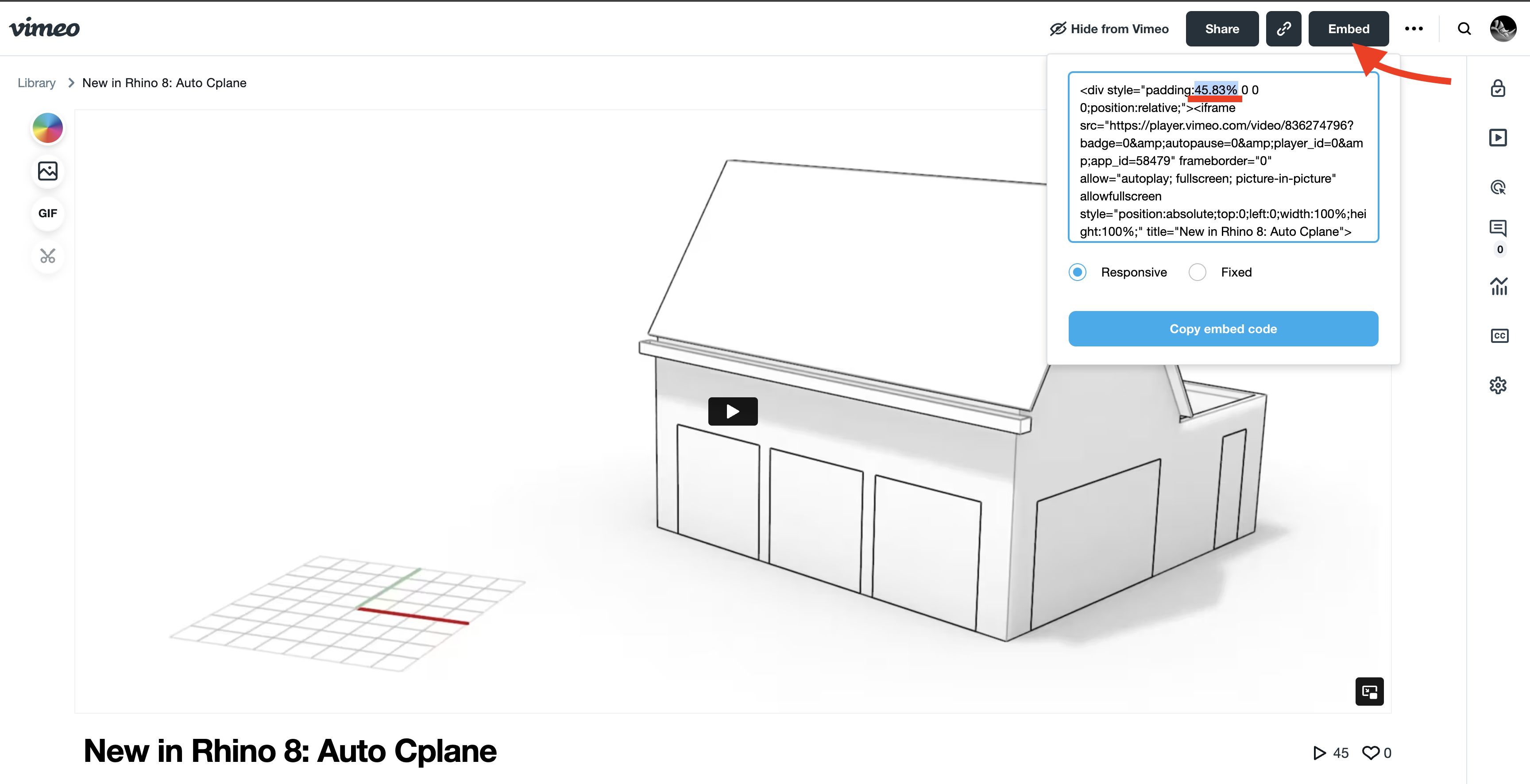
Update: Optional padding parameter added to make the iframe size fit the video tightly. The value for padding varies and depends on the aspect ratio of the video. Vimeo calculates this when you try to get the embed code for a video. Simply copy and paste the xx.xx% (including the %) to padding parameter: padding=xx.xx%
YouTube
Hugo has a built-in youtube shortcode that can be used to embed videos like this:
{{< youtube TeTiZuSbQz8 >}}
produces:
Year
Prints out the current year. Useful for copyright notices, etc.
For example:
{{< year >}}
produces:
2026What’s New
Wikipedia Link
Use: {{< wikipedia-link Cosmic_latte >}} to get: ikipedia: Cosmic latte
Print Formatting
This guide also has `@media=“print” formatting that can be used to format PDF printed pages properly.
Page Break for Printing
Manual Page Breaks can be inserted by this page-break shortcode:
{{< page-break >}}
Automatic Print Formatting
Specific print formatting based on CSS styles can be to the file
\rhino3d.com\themes\rhino3d.com-theme\assets\scss_print.scss
For instance this code will Avoid breaking the Section Titles with the first paragraph of the body.
  h3, h4 {
    page-break-after: avoid;
  }
This code will make sure paragraphs and notes stay together stay together:
  pre, blockquote {
    page-break-inside: avoid;
  }
  div.details {
    page-break-inside: avoid;
    page-break-before: avoid;
  }
Headders, Footers and page numbers are also added to each page when printed.