
{{< card-container >}} takes appearance tokens only (documented in the style guide). The body follows a few positional conventions:
- A picture as the first block is the media: flush with the card, 16:9, cropped. A picture with its own
width(imageshortcode) is just an inline picture at that size. - Layout inside the card is not a param. Use
row/column(now withnowrap,gap,align, and a fixed columnwidth) to put things side by side. Each column keeps the slot rules: a trailing button, hotlink or badge is pinned to the column’s bottom, and a picture in a column is an inset picture with the card’s corner radius. - A lone Font Awesome icon as the first block is the accent icon.
- Headings are titles. A linked first heading (
### [Title](/url)) or a linked first picture makes the whole card clickable. - A trailing button, hotlink or badge line is pinned to the bottom. A rule (
---) right before the last block turns that block into a footer note.
1. Rhino Courses (WWW-3607)
{{< card-container >}}
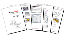
### [Level 1 - Training Manual](/learn)
A complete introduction to 3-D modeling in Rhino…
**[Robert McNeel & Associates Course](/learn) · By Mary Ann Fugier**
{{< badge background="#2f8a34" outline="true" >}}Beginner{{< /badge >}} ~24 hrs
{{< button link="/learn" block="true" >}}Start course →{{< /button >}}
{{< /card-container >}}

A complete introduction to 3-D modeling in Rhino: interface, precision tools, curves, surfaces, and layouts. Level 1 certification prep.
Robert McNeel & Associates Course · By Mary Ann Fugier
Beginner ~24 hrs
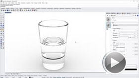
Advanced surfacing, continuity, history-enabled modeling, and an intro to Grasshopper. Level 2 certification prep.
Robert McNeel & Associates Course · By Mary Ann Fugier
Intermediate ~24 hrs
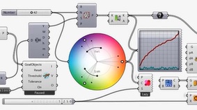
Essential Algorithms and Data Structures for Grasshopper
A visual introduction to algorithmic design and Grasshopper’s data structures.
Robert McNeel & Associates Course · By Rajaa Issa
Advanced ~6 hrs
2. Tutorials & Guides (WWW-3611)
Badge last, so it is the pinned line.
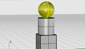
Your first session: interface, navigation, and drawing your first accurate curves.
18 min
Beginner
Snaps, coordinates, and constraints: everything you need to model to real dimensions.
27 min
Beginner
A step-by-step introduction to visual programming and parametric definitions.
42 min
Intermediate
3. Community & Channels (WWW-3614)
Icon first, plain heading (not linked, so no hover), hotlink last.
Ask questions, share files, and search a decade of answered problems.
Tutorials verified for your version and platform, so what you watch matches what’s on your screen, whether you’re on Windows or Mac.
Tutorials verified for your version and platform, so what you watch matches what’s on your screen, whether you’re on Windows or Mac.
4. Text cards (WWW-3623, WWW-3628)
A rule under the title is a divider. A rule before the last paragraph makes it a footer.
- Market visibility - get a competitive edge by being listed in the official Rhino Custom Training directory and posting classes on the Rhino website.
- Exclusive resources - access specialized training materials, instructor-only webinars, and regional support.
- Professional credibility - join an exclusive network of verified experts.
- Promotion & reach - your upcoming classes are featured in the monthly Rhino Training newsletter.
To qualify, applicants - individuals or centers - must demonstrate expertise and commitment to the software:
- Proven experience - at least two years of Rhino modeling experience.
- Official certification - Level 1 & Level 2 Official Certificate.
- Content creation - submit a high-quality video or written Rhino tutorial.
- Licensing - verification that you own and run an up-to-date Rhino license.
- Formal application - successful submission of the official authorization application.
Authorized Rhino Trainer (ART)
An individual specialist certified by McNeel to run official training modules.
- Official endorsement - recognized by McNeel as an official trainer.
- Global visibility - listed on the global Learn directory.
- Curated resources - exclusive curriculum and teaching assets.
- Free updates - a technical session with every new release.
Part of a worldwide network
Authorized Rhino Training Center (ARTC)
A school, department, or commercial lab recognized to teach at institutional scale.
- Official endorsement - recognized as an official training site.
- Global visibility - classes listed on the global Live Course calendar.
- Curated resources - exclusive curriculum and teaching assets.
- Free updates - a technical session with every new release.
Part of a worldwide network
5. Icon cards, horizontal (WWW-3675)
No layout param. The card is the box; a row nowrap="true" with a fixed-width first column puts the picture beside the text, and the column width is the picture size.
{{< card-container border="accent" hover="lift" >}}
{{< row nowrap="true" gap="small" align="center" >}}
{{< column width="96px" >}}

{{< /column >}}
{{< column >}}
### [food4Rhino](https://www.food4rhino.com)
+800 apps/resources for Rhino and Grasshopper.
{{< /column >}}
{{< /row >}}
{{< /card-container >}}

+800 apps/resources for Rhino and Grasshopper.

Our forum: simple or complex questions, from new or veteran users, about all our products. Rhino Teachers category

Classroom training, online training, workshops, conferences.

The linked heading inside the column still makes the whole card clickable.
6. Appearance tokens
Same body, one param changed per card. The heading is a plain ### line inside each.
radius
border, shadow
hover
padding, background, centering
cropped, letterboxed and sized pictures
7. Other ways to link and picture
The middle one is a picture-only card: the linked picture is the whole-card link.
8. Interop

Text continues after it.
7. Subscribe banner (WWW-3622)
The Subscribe shortcode inside a card. Text left, button right: row nowrap="true" align="center", and the button’s column is width="auto" so it only takes the space the label needs. On a gray card the pill rests on white.
{{< card-container background="gray" border="none" >}}
{{< row nowrap="true" align="center" >}}
{{< column >}}
### Stay in the loop
Get new guides, materials, and workshop alerts in your inbox.
{{< /column >}}
{{< column width="auto" >}}
{{< subscribe maillist="profession" id="2" label="Sign up for Educator News" />}}
{{< /column >}}
{{< /row >}}
{{< /card-container >}}
Stacked, as a card’s last block: the button is pinned to the bottom like a button.