Open Rhino 9 and you’ll immediately notice a clearer, smarter, and more intuitive interface, led by redesigned toolbar icons that improve usability. While Rhino’s versatility puts hundreds of commands at your fingertips, this update helps make them easier to navigate and learn.
Designed for Clarity. Built for Efficiency.
In earlier versions, toolbar icons shared the same base color, followed inconsistent visual logic, and often packed in too much detail. Combined with a style that differed from Grasshopper, this made it harder for both new and experienced users to quickly recognize tools and build muscle memory within the workspace.
Rhino 9 introduces a smarter, more user-focused design system.
A New Language of Color
A thoughtfully crafted color-coding system now helps you instantly identify tools by object type and task.
Built on the UI-optimized Open Color palette, this system brings visual consistency and faster recognition to your workflow.
Icons That Communicate
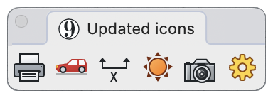
Each icon is now designed to clearly express its function at a glance. Only the modified feature is highlighted in color, while the rest remain neutral, making it easier than ever to understand what each tool does. Input and output geometries are also visually distinguished, reducing guesswork and boosting confidence.

Simpler. Sharper. More Readable.
Key icons have been redesigned with simplicity in mind, improving legibility without sacrificing meaning. The result is a cleaner interface that works with you.
One Ecosystem, Seamlessly Connected
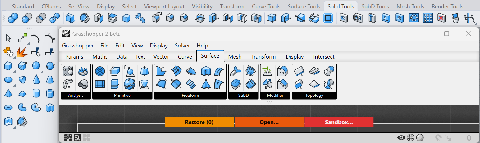
The updated visual style brings Rhino closer to Grasshopper 2’s visual style, creating a more cohesive experience across tools.
Modes That Match Your Environment
Designed for both light and dark interfaces, these icon sets adapt instantly to your environment.
Rhino 9 is more approachable, more efficient, and more intuitive from the very first click.
Download Rhino 9 WIP for Windows or Mac.